


4 Week Portraiture Cycle
For this assignment, we were allowed complete freedom in what we wanted the theme to be. I decided to go for the theme of distortion, because I felt as if it was the best course of action.
Databending
I decided to do databending for my first experiment. This is basically when you import an image into an audio editing software (I used Audacity) and add effects in order to create a glitchy and distorted image.

Above is the original image that I used for this experiment. I took this photograph at a beach on a Photography trip to Dungeness. This was a JPEG file to begin with, so I had to convert it into a Bitmap file so that it was compatible with Audacity, which can only import Raw data. The first thing that you want to do once you have started audacity is to click the File tab, then Import, and find the 'Raw Data' button. This will allow us to import our Bitmap photograph.

Then, find the Bitmap file that you converted, and open it. You will then be presented with an 'Import Raw Data' window, in which you will select 'U-Law' encoding, and the 'Big-endian' Byte order.


You will now have the audio form of the photograph. Don't play it however, it's just white noise that isn't exactly listenable.

Then, you select a portion of the audio, (you want to leave the beginning and end of the audio intact, as these areas contain information about the file, and if changed it may result in you not being able to view the file.) and apply an effect to it. For this demonstration, I will be applying a delay effect, and I will also be inverting a small part of the waveform. (this means that the peaks and troughs of the waveform are switched around. The audio will sound the same, but it does result in an interesting effect on the image.

I changed some of the settings in the delay panel to a 'bouncing ball delay type, and I changed the pitch change effect to an 'LQ Pitch Shift'.

You are then left with your final image, where you have edited it. You can see where the audio looks a lot bigger in the centre, and that's where I added the delay effect. Between 6:00 and 7:00 is where I inverted the waveform.

You will then want to export the audio. When doing so, make sure that you select 'Other uncompressed files', and save it as a .bmp (or whatever file extension suits you best). Also, make sure that the header and encoding is the same as when you imported it, just so that this process works.

When you open up your image after the export, you will be presented with something similar to what I achieved (provided you followed the same steps that I did). The delay effect is evident through the ghostly repetition of the subject, and the blue stripe is the inversion of the waveform.

Below are some more examples of databending. This is just where I decided to play around with more effects to see what I could produce.
 |  |
|---|---|
 |
 |  |
|---|---|
 |
 |  |
|---|---|
 |
 |  |
|---|---|
 |  |
|  |
 |
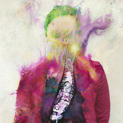
Hypnogogia Responses
(By Kalliope Amorphous)
The first artist that I looked at was called Kalliope Amorphous. On her website, she has quite a few portfolios that she has worked on, but for this project I am solely focusing on her 'Hypnogogia' line of work.
 |  |
|---|---|
 |  |
 |
This is (as it says on Kalliopes site) that “the term hypnogogia was coined by Alfred Maury to describe the state between wakefulness and sleep. Hypnogogia can often produce fleeting, fragmented visions prior to sleep. Psychoanalyst Herbert Silberer described one of the processes of Hypnogogia as “autosymbolism” – a loosening of the ego which turns subconscious abstract ideas into tangible images.” This state has been used for hundreds of years as a source of creative thought by many people. One of these people was Salvador Dali, who would use a method of keeping himself in the state to produce creative ideas. Kalliope used physical methods in order to create the effects that she achieved (reflective surfaces, handmade magnifiers, projectors, etc), but I took a more digital approach to creating my responses.
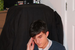
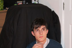
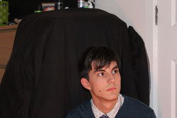
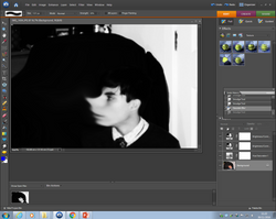
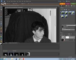
I took 8 self portraits by using my camera's auto-capture feature, and I used some of them for my editing. The aim of this shoot was rather simple, it was just to get some images of myself so that so that I could edit them. I didn't think that expression in these images mattered at all, (since the images would be edited to make the expressions void) so I just looked around my room to provide different angles and features to play with. I also used a black sheet draped over my drawers to provide a black background to the images, just like in Kalliopes series.
 |  |
|---|---|
 |  |
 |  |
 |  |
For my first response, I took ‘IMG_1434’ as the base image, and decided to play around with it. First, I added a Hue/Saturation layer, and turned it all the way down. However, I felt that the black and white could be a little harsher, so I added 2 Brightness/Contrast layers, with the contrast all the way up. I felt that this was adequate, so I moved on to the next step. I used the smudge tool with a size of 1331px to smudge my face around a few times. I also added a gaussian blur to the image to create an ethereal effect to the photograph. I removed any white from the background, and I was done.
 |  |
|---|---|
 |  |
 |  |
 |  |
 |

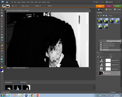
I used ‘IMG_1453’ for my second response. Just like before, I added the Saturation and Contrast layers to achieve the effect I was going for. This time however, I used the clone stamp tool to create a duplication of my face going up and fading away the further up it goes. The removal of the background was also done by using the clone tool. I particularly like this response, because it looks as if I am trying to think of better things to distract me from bad times, which is why I entitled it “Escapism”.
 |  |
|---|---|
 |  |
 |  |
 |  |
 |  |

My third response is a little different to the others so far. I used ‘IMG_1437’, and I achieved the final image with the marquee and transform tools. I began by duplicating the background layer and selecting parts of the copy and moving them around. When this was done, it created a staggered effect which looked quite glitchy. I then went ahead the Contrast and Saturation layers (just like in all of the images), and added another Gaussian blur. The image was looking quite small and in the corner, so I duplicated the manipulated layers again and moved halves of my face to the opposite sides, both at a 50% opacity. I would say that this is the response that I am pleased with the least, because it looks a little messy and I think it could’ve been executed a little better.
 |  |
|---|---|
 |  |
 |  |
 |  |
 |  |
 |  |
 |  |
 |  |
 |

Response 4 is another one of my favourites. I used ‘IMG_1431’ for this, and I only made a few edits in order to achieve what I did. The Saturation and Contrast layers were added, and then I duplicated the background layer. I then added a motion blur at 90°, which made everything go all fuzzy, but only in the direction I specified. I then erased the parts in the duplicated, motion blurred layer where the eyes were in the original layer, and I was finished.
 |  |
|---|---|
 |  |
 |

My fifth response (‘IMG_1432’) is another one where I’m not too sure on how I feel about it. I added the Saturation and Contrast layers again, and I duplicated the background layer, and turned it upside down. I then turned that layer to a 50% opacity, so you could see both. I moved the duplicated layer to where I felt that it looked the best, and then I erased the parts that I didn’t want to make it look neater. I removed the background, and then I was finished. Again, I’m not too sure how I feel about it, because of how it looks and where it is in the frame. It looks quite small, and it isn’t taking up a lot of the space that’s available. However, I think that it could create an isolated effect, which is always good to have in things like this.
 |  |
|---|---|
 |  |
 |  |
 |  |
 |

At the point of my sixth and last response, I had ran out of ideas. I took my least favourite images from the contact sheet, (‘IMG_1433’) and decided to make something that didn’t look like anything else in this response series. I created a new layer, and turned it completely black. Then, I erased where the eyes would be, which isolated the eyes. Then, I merged the two layers and went to town with the clone stamp tool, creating a cloud of eyes. I added the Saturation layer, however this time I only used one Brightness/Contrast layer, in which I upped the brightness a bit and put the contrast up all the way. I’m quite pleased with the outcome of this, especially since I didn’t really have an idea of what I wanted the outcome to be. I named it “Paranoia” because it reminded me of the feeling of being watched, which is a form of Paranoia.
 |  |
|---|---|
 |  |
 |  |
 |  |
 |  |
 |  |
 |  |
 |  |
 |

Impermanence Responses & Final Piece
(By Seung-Hwan Oh)
 |  |
|---|---|
 |  |
 |
Seung is a South Korean guy who studied film and photography in Hunter College, in New York. He has a lot of work that is inspired by the notion of the first advent of vision on life on earth (his series Camoflauge), but the project of his that I will be focusing of is his 'Impermanence' series of work. This used emulsion-eating microbial fungi growth to create distortion on the photographs. This effect took 3 years to produce, so if I were to do something similar, I would have to think of an alternative that would achieve the effect much faster. The fungi creates colourful, almost fractal patternts in some photographs, and completely destroys others. I think that it is fascinating how each photograph looks. I also like how experimental the project was, in that the outcome wasn't in the control of the artist, but instead it was in control of the millions of microscopic organisms.
The idea of his work is to represent the state of not lasting forever, hence why the photographs look destroyed by the micro-organisms. If I were to do something similar, I would try and narrow the concept down to memories. I think that the forgetting of memories alongside this method and concept will make for an interesting final piece.
One way that I can try to achieve this look by using my own fungus that has been growing for about a year or so now. This fungus has been growing in this small tub of slime that came with an old science kit, and it's been growing in there because it's a little like agar jelly. I've just been keeping it in there just to see how bad it could get, but I think it's about time to put it to use. To attempt to recreate this artists effect, I will print out a portrait photograph of myself and put it with the fungus infested slime in a tupperware box for a week or so, and see what happens. This is an entirely experimental technique however, because I'm not sure at all what is going to happen. The fungus that is growing might either not be the type to grow on the film, or dead entirely. I guess we'll have to see.
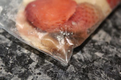
Another method that might achieve the same effect is the destruction/ruining of the film in a disposable camera. This distorts the photographs in a similar way, but it still creates a wonderfully interesting effect that is still lovely to look at. The way that I plan on ruining this film is by taking a bunch of photographs with it, and then growing mold on the film. This will most likely create an array of phenomenal colourful effects. I will have to get the photographs professionally developed, but I will have to tell the people in the photo lab that the film has mold on it on purpose, so they will understand and develop it anyway.
I ended up choosing th elast method, so I ventured out and bought myself a disposable camera. Once I had made sure that I had taken all 27 photographs on my Fujifilm 'Quicksnap' disposable camera, I proceeded to take the film out. I took the label off of the camera, and looked for the compartment that the film was in. Once I had found it, I took it out carefully as to not damage the film (any more than how much I was going to damage it anyway). The original plan was to grow to mold on some moist bread, but since we didn't have any bread in the house at the time, I turned to soft fruit instead. I took some frozen strawberries and a couple of banana slices and put them in a Ziploc bag alongside the film. I also added a little but of water just to provide a little moisture. By the end of the first day, (which was the day I started), the ice crystals all melted, leaving mushy strawberries and banana pieces.
 |  |
|---|
By day 2, there was already some discolouration to the strawberries.
 |  |
|---|---|
 |  |
Day 3 was the same, but the discolouration was a lot more drastic.
 |  |
|---|
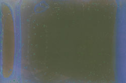
On day 4, there was some visible mold on a few of the strawberries, and there was a translucent liquid pooling at the bottom of the bag. The mold growing on the strawberries was a success, but whether or not it grew on the film was a mystery.
 |  |
|---|---|
 |
On day 5, I carefully (and in a well ventilated area) removed the film from the bag, sealed the bag back up, and threw it away quickly. I washed the film lightly, and removed all of the strawberry remnants from the outside, and tried to mask the smell as best as I could. I then went into town and into a shop called “SnappySnaps”, and I told them that I safely grew mold on the film and asked them to develop the film anyway. They kindly agreed, and even though the film stank out the entire shop, the staff were all very kind and cooperative.
A couple of days later, I went back into the shop, and retrieved the CD with all the images that I paid for. The people were lovely when I went there, and I handed in my slip in exchange for my CD with the photographs on, and the original film (The film didn’t smell so bad this time though). I did ask them if they had any trouble with any of the images, and they said that they did, which was a good indicator that this method worked to some extent. The images here were mostly unintelligible, in that you couldn’t tell what was going on. This however was probably due to me being inexperienced with film cameras, and I probably needed to use the flash on the camera more often to help with exposure. This does coincide with the meaning behind this project though, in that this series of photos is supposed to represent the fading and the loss of memories. The aim of this shoot was to go about my day and take pictures of my surroundings when I particularly felt as if I was enjoying myself, as a little diary of my day. In a way, this entire line of images is one big self-portrait, because it re-tells moments of my life that I would’ve otherwise forgotten about.
 |  |
|---|---|
 |  |
 |  |
 |  |
 |  |
 |  |
 |  |
 |  |
 |  |
 |  |
 |  |
 |  |
 |  |
 |  |
 |
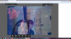
The images that are somewhat unintelligible could say that they represent the good times that slip your mind. When looking at all of the images on the contact sheet, I noticed a pattern with some of them in that there were blue streaks going down each one. I picked out my 6 favourites (favourites because they were the clearest ones), and decided to experiment with them further. One of the images that I experimented with was the one with me and two of my friends in front of the whiteboard that says “Last Picture” on it. I felt a little bit left out of the picture because I am just visible on the right but not all the way, so I added an image of myself from the same series at a 50% opacity, and then heightened the contrast and added a blue filter to bring out the blue streaks that was created by the tampering of the film.
 |  |
|---|---|
 |

The next one was of two of my friends on their way to Art. I decided to do the same thing again, but this time instead of adding myself I added another picture of a different set of friends (besides Alison) on their way to our regular hang out space. I felt as if these images went quite well together, as if they had some sort of synergy in that they are both of times where I was with my friends taking a journey to somewhere where we could just chill together. I then heightened the contrast again, and added a filter which really brought out the reds and greens from the background, and even added a vignette for dramatic effect.
 |  |
|---|---|
 |

The image that I chose for my final piece here was the one with the words “Last Picture” on it. This combination of words in the context of the project I found to be quite chilling, in that this is representing the last memory that I had before I forgot the time that I had spent doing what I was doing at the time.
4 Week Cycle Final Piece
