


Photography Exam

We were given a set of 5 questions for this exam. I initially crossed off the 'Available Light' and the 'Documenting Contemporary Life' out, because I have already worked with light in my abstract cycle, and I was struggling to come up with ideas with the other one.
As you can see, in the 'Everyday Activities' question, I talk about staying with some family members over the Christmas period. I did have a spectacular time, so doing a photography project on it would be nice. When we were opening presents, we were all given black and white film disposable cameras so we could document the time we spent together. Naturally, when I get given a camera that works with film, I want to do something to damage the film to make some interesting effects, just like I did with the mould on the film back when I did the 4 week cycle project. I came up with a similar idea with the Modern pedestrian life, where I would take photographs of the lives of passers by, but I'd take the film and destroy it to create an effect.
For 'The Digital Image' question, I came up only with a couple of ideas, but not really enough for me to go on for an entire exam. Similarly, I didn't really think of much for the 'Self-identity' question.
I definitely think that the 'Everyday Activities' question would be the one that I should focus on, because it has been the most bountiful in the ideas that I have generated from it. I think that the other ideas that I have come up with will still be able to be used however, so not all help is lost.
Family Life
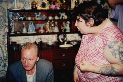
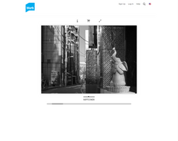
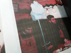
The first photographer that I was given to look at was Richard Billingham. Billingham is a photographer from England, whose most famous work is 'Ray's a Laugh', a photobook containing photographs of his subjects, his alcoholic father and overweight mother. 'Ray's a Laugh' is a fascinating piece of work, because it gives a very whimsical insight into his life. These photographs have a lot of character too, The living space that the photographs are taken in is very unique, and the subjects fit in that space being quite unique too. What also charms me about these photographs is that they are not set up, they are all in the moment. This particularly gets me in a couple of photographs, especially the one with the cat that is in mid air.
As you can see on the right, I have chosen a few photographs that I think reflect my previous point especially. The colours all seem natural too, which is something that gives it a very organic feel to it. There are also shots that are out of focus, and shots that don't necessarily follow any rules of composition, and that doesn't make these photographs bad, it makes them aesthetically pleasing in a certain way.
 |
|---|
 |
 |
 |
 |
Another thing that this photographer did that I think is interesting is that there is no singular final piece, the whole thing is encompassed in one photobook that was one piece, so I think that that is worth looking into.
Another photographer that I looked at for this cycle goes by the alias 'Kodak Disposables' on Tumblr. What this person does is just take photographs of her friends with disposable cameras, and I think that the way that the photographs are is just perfect for this cycle. The work is quite similar to that of Richard's, but this time the subjects seem to be college students, living the life partying and such.
I think that these photographs are brilliant, as they act as something nice to look at, as well as an insight into this person's life. These photographs also seem to follow the Taoist concept of "wu-wei", which is basically the belief that if you don't really try, you succeed. For instance, you don't need to force a river to flow, it just does. I think that this may be worth looking into if I would like to work in this style for this cycle.
 |
|---|
 |
 |
 |
 |
 |
 |
 |
 |
 |
 |
 |
 |
 |
The aesthetics of this photographer's work is pretty much the same as Richard's too, because if you have a look at the photographs, there doesn't seem to be any compositional value or thought to the photographs, it's just the raw experience that is caught in the moment with a disposable camera. I think that the look of the film photography that this photographer employs also adds to the look of the photographs, it again adds to the feeling of the photographs being the window into a moment in time, as opposed to a pre-planned shot with a high quality DSLR.
I think that the shoot went quite well, I did try to mix a Billingham type look with the blogger's look, where none of the shots were specifically planned. One thing that I did well I think was the fact that I managed to space out the exposures properly between each day, so that I didn't end up taking too many images in one day and not enough in another. Unfortunately, I can't really talk much about the composure or the lighting because I took the photographs on film, so I can't really see them until they get developed. However, I did try to not try with the photographs, allowing my photography to shoot itself, employing that "wu-wei" (or "action without action) concept to my work. Hopefully, my photography turns out as aesthetically pleasing as the Bloggers, or indeed as Richard's. One thing that I am preempting however is my use of the flash, I think that I didn't use it enough again so that may result in some of the photographs being underdeveloped.
Once I had run out of exposures on the film reel, all that I had left to do was to make myself a film soup.
My film soup for this cycle was pretty simple, I just went with a method of using dilated lemon juice. I had found a tutorial online made by user 'simonesavo' on Lomography.com. In this tutorial, it says that I needed to grab a drinking glass, some warm water, some lemon juice, and a fully exposed 35mm film reel, all of which I had.
Firstly, I had to make sure that there was some warm water in the glass. This was the easy bit, I think. After that, I had to immerse the film in the warm water, and then add the lemon juice. The tutorial used an actual lemon, (I actually think it's a lime, but citric acid is citric acid) but I only had straight lemon juice from a bottle, so I added however much I thought I needed. Then, you leave it for 2 hours, just to sit there. Ignore what I said earlier, this was definitely the easiest part. Then, I had to leave it to dry, which would take 2 weeks or so. At the moment, I'm still waiting for it to dry, so hopefully by the end of this cycle it should be done.
 |  |  |
|---|---|---|
 |  |  |
 |  |  |
 |  |  |
 |  |
The tutorial that I had mentioned earlier had given some examples of what the experiment had given them, which I have shown to the right. The interesting thing here is that some of the colours have changed completely, and even in some there are some colours that have been introduced that weren't there before. This example was done with colour film however, so I have absolutely no idea what it would look like with the black and white film that I have used.
 |
|---|
 |
 |
 |
 |
 |
 |
 |
 |
 |
After the film had dried after 2 weeks, I went over to 'Snappy Snaps' in town center, and handed it in. Before I went in, I thought I would be clever, and ask them to put the photographs on a memory stick, just to save on money. However, the shop that I went to doesn't develop Black and White film, (which I shot on) so they had to send it to their sister company, which did. I ended up paying almost double that of what I would've paid if I shot on colour film, £17. Not complaining though, my Dad paid for it.
Now all I have to do is wait for the photographs. Meanwhile, I think I'll look at a couple of photographers in the mean time to inspire me for my next cycle.
Urban Life
For this cycle, I wanted to wait until I went to London with the school on a trip on the 9th of February, because I don't think that there is a better place to capture urban life than in London. I used a film camera for this project, because I have recently got into film. I personally enjoy the entire process of shooting film, and I think that the look of the final image after it's processed and scanned is quite pleasing to me. Anyway, I ended up using 2 35mm film rolls for this, one with 24 exposures, and the other with 36, which means that I took 60 photographs, which means that I have quite a few photographs to choose from (if I decide to choose from them in the first place). I think that the shoot went very well. We went to the Tate Modern, the White Cube, and the Tate Britain, and I tried my best to photograph people during their every day activities. In the White Cube, there was an exhibit called 'Walhalla' by Anselm Keifer, and in Tate Britain, there was a David Hockney exhibit, which I was very excited for, since I have studied David Hockney before. We also went to Borough Market, where I took a couple of Photographs as well.
With this cycle, I tried to keep the concept of 'Wu Wei' at the forefront of my mind. However, recently I have discovered something similar to it, called Lomography. This started out as a movement created by a group of Viennese students when they found a camera called the LCA, which is a camera created by LOMO PLC, of Saint Petersburg, Russia. They were inspired by the colourful, unique, and sometimes blurry images made by the camera's set focus lens. The movement began when they put photographs taken with this camera into an exhibit. The art movement then turned into a business enterprise, where they now sell a bunch of different weird photography things, like Purple grade film, and a range of 'Art Lenses'.
Lomography has a motto, which reads "Don't Think, Just Shoot". This motto is then accompanied by 10 Golden Rules that you can follow if you want that Lomographic look.
1) The first rule is "Take your camera everywhere you go". I certainly followed this rule, as the camera I was using never left my neck the whole time.
2) The next rule is "Use it any time – day and night". Again, I managed to follow this rule, since the trip lasted until it was dark outside, so I got some exciting night-time shots.
3) This next one was a little difficult to understand for me. The rule is "Lomography is not an interference in your life, but part of it". I understood this to mean that whenever you see something worth photographing, then it was worth photographing.
4) "Try the shot from the hip". This rule was quite fun for me. It basically means that you should try not using the viewfinder for a shot. Using a film camera, this was a little risky because I couldn't see the photo afterwards, I'm going to have to wait and see how those shots turned out.
5) "Approach the objects of your Lomographic desire as close as possible" I don't really think I attempted to follow this rule. I was at an ideal distance for most of my subjects, since they were all people. I did get a couple of portraits in, though.
6) "Don’t think". I think I did okay in following this rule, however I did abide by the rule of thirds quite often, using the left hand bottom corner a lot. Hopefully they turn out alright.
7) "Be fast". I tried doing this one quite a bit. The issue with shooting passers-by without their permission is that they are moving about on their own accord, so you have to act fast, and take their photograph before they go away.
8) "You don’t have to know beforehand what you captured on film" This basically means that you should go into a shoot having no idea what you are going to take photographs of. I kind of followed this rule by accident, because I kept on forgetting what was on the itinerary.
9) "Afterwards either". This links to the previous rule, just saying that it might just be best to forget what you shot on the film, because it would make it more fun to look through them once they've been developed.
10) And finally, "Don’t worry about any rules". I think I had the most fun with this rule, because all I had to do was pick up my camera and shoot something. I didn't have to bother with composition, ISO numbers, aperture, or anything really. I reckon that I successfully didn't think, I just shot.
I was given one photographer to look at for this cycle, and then I found two other ones for me to look at. The one photographer that I was given is named "Robert Doisneau".
Robert's photography is quite fascinating. He captures the life of passers-by, which I aimed to reflect in my photography for this cycle. Doisneau was a french photographer in the 1930s, and he used a Leica camera, which oriented the image frame sideways on the 35 mm film as opposed to the cine-camera tradition of across the film-strip. The portfolios of his that I was focusing on for this cycle are his "PARIS: PATHWAYS AND GALLERIES", portfolio, and his FOREIGN COUNTRIES: USA" portfolio. This is because I feel that it really captures his focus of Urban Life really well, also because one of the portfolios is based in an art gallery, and a lot of my photographs were taken in a gallery as well.
Like I said, I attempted to reflect what Robert Doisneau's photography. I didn't copy it though, that wouldn't be good. The only thing that I did similarly was that I took photographs of people just going about their business. They are portraits in a way, but they aren't head on photographs, and they are a lot more candid. When I went to the Tate Modern, I tried to shoot some people in a similar way, without their permission. There were a few places where I wasn't allowed the flash though, and this resulted in the shutter going a bit slower, meaning that the photograph would be a bit blurry. That's alright though, Rule #10 of Lomography says not to worry.
 |
|---|
 |
 |
 |
 |
 |
 |
|---|
 |
 |
 |
 |
 |
 |
I also liked this portfolio somewhat, since it was one of the only colour portfolios he took. Not only this, but it also seems to follow a couple of the 10 Golden Rules of Lomography (I don't think he directly followed them though, Lomography started in around 1992, two years before Doisneau's death). For instance, the man in the red jumper in the first photograph is blurry, but he still published the photograph. Also, in a lot of the photographs, composition seems to not really play a part, but they still look quite wonderful to look at.
Another artist that I looked at has a similar approach to Doisneau, and her name is (rather appropriately) Wu Wei.
Wei was born in Sichuan in 1992, and the portfolio of hers that I will be focusing on for this is set there also. There is a river in Chengdu (which is a city in Sichuan), and Wei followed this river down and photographed the people there along the way. This photography project is very similar to that of Robert's, as it contains candid photographs of people going about their daily routine. However, I particularly enjoy the colours that the photographs use, especially where a brilliant green can be seen in almost all of the photographs. Below is a collection of photographs from the "Meeting Myself Coming Back" portfolio by Wu Wei that I think really works well with the aim of this cycle.
 |  |  |
|---|---|---|
 |  |  |
 |  |  |
 |  |  |
 |  |
One thing that I think I took into account about this photographer when I went shooting my film was that I only shot things that captured my attention and stood out to me. I didn't just shoot any old thing, I took photographs of things that were captivating. I can only assume that this is also the case for this photographer, because none of the photographs that she took in this portfolio is boring, they all have character and are all enthralling.
Since I took exposures on 2 reels of film, I think I'm going to keep the one with 24 exposures normal and make a film soup or deteriorate the film somehow for the one with 32 exposures, because I feel that my strongest photographs are on the 24 exposures one. At the point of me writing this, I have just received my photographs for Cycle 1, so we should take a look at those.
Family Life: Analysis of Photographs
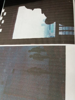
There was a little bit of trouble having the film developed, because I wasn't very careful with destroying the film. I did leave it to dry, but there was still lemon juice stuck in the film cartridge, which meant that the 2+ weeks that I left it to dry, there was still a reaction going on. Also, the company said that a lot of the photographs were just black (15 of them), and I'm not really sure if that was to do with the fact I didn't use the flash, enough which caused the photographs to be underdeveloped, or due to the elongated amount of time that the film was in contact with the lemon juice. If I were to do this experiment again, I think I would wash the film out with cold water, just to neutralize the acidity, and to stop the reaction, like I did with the 'My World' Cycle. I might just blame that on the tutorial though, it did never say to wash the film out. Anyway, I only received 9 photographs back from the total 24 that I took. It's not really that much of a bother though, because the ones that I have gotten back look fantastic.
The first photograph is on my uncle, seemingly cleaning his glasses. The dynamic of this photo is really interesting, how the shades turn darker to lighter from right to left. Also, The subject of the photo is situated on the left third line, which naturally draws your eye to him. The last thing that I want to address was created by the lemon juice, and that's the black cloud with dark tendrils reaching down to the bottom of the picture. I'm quite a fan of how this looks, however I am a little disappointed that one of the streaks covers my uncle slightly.

The next photograph I recieved is quite an interesting one. I managed to catch one of my cousins off guard and snapped a funny photograph of him with his eyes half open. This would've been a good photograph to begin with, as it is similar to photographs by both photographers I studied for Cycle 1, but there is also a whole bunch of abrasive effects, like the black splodge on the top-right corner, and the scratchy looking effects at the top.

The third photograph is a little simpler than the others. It just consists of my cousin making a funny face again, but the effects made from the lemon juice isn't as prominent in it. There does seem to be a few lines going down the photo though, that's quite cool.

The next photograph isn't that noteable, the only things that you can make out really in this photo are the sheets of paper on the left. On the right however, there are a whole bunch of shapes created by the erosion caused by the lemon juice, for instance, the horizontal lines at the top, the circles at the bottom, and right underneath that, the jagged lines, which I think is a tear in the film. Even if the photograph itself is a little boring, the effects are quite wonderful, which makes up for it.

The effects on this next photograph aren't that wonderful, you can see a few scratches and a few amorphous blobs on the right side, but the interest really lies in the composition and the mise-en-scene of the photo. I quite like how natural and organic everything looks. I achieved this by bursting into the room and taking a photo. Not really that discreet, but it does work out in the end.

This is another one of those dark photographs that you can't really make anything out of, so the real focus lies on the abstract shapes created by the lemon juice on the film. Similarly to one of the previous photographs, there are those jagged lines near the bottom and the top of the photo, but they taper off over to the left, creating lines. there are also some globular shapes over to the right. The abstractness of the image can also be seen in the photograph itself, with the brick pattern in the background, and the square shapes created by the door on the right. This seems to be a very abstract image indeed.

I like the patterns on this photograph more than the actual photograph I think. The photo isn't bad, but it isn't really all that unique. The jagged lines are really prominent down at the bottom right though, and there are some horizontal scratches at the top right.

And here we have another photograph where you can't really see much but the patterns. I do like the blobs however, it almost looks like they are two characters having a conversation. Even though there isn't much to look at here. I still enjoy the photograph because of the abstract elements that it has.

Last but not least, we have our final photograph. This one is quite similar to the first photo that I showed, in that it involves someone that has been covered up slightly by this dark mass and its tendrils. I like this photo in particular though because it shows my cousin taking a picture of me on a similar disposable camera.

Overall, I am quite impressed with the outcome of the experiment. However, I am a little disappointed that I only received 9 photographs back out of the total 24 that I took, but if you take a look at the negatives that I got back, you'll be able to see that there was no way that any scanner in the world would have been able to retrieve an image out of it. I think that this experiment wouldn't have worked as well if it were on colour film. First of all, I would've had a general idea of what it would've looked like, as I had seen the tutorial, and secondly I really like the harshness of the contrast of the black and white, and I think having too many colours would've cluttered the image. On second thoughts, I don't think I would've done this any differently. I don't think that the lack of pictures I got back was due to the lemon juice, so there wouldn't have been any danger there. and the effects created by the lemon juice are very unique, and I have never seen anything like it anymore. I don't think that these require any digital editing, I should just leave them be, as they are perfect as they are.
While I am writing this review of these lemon juiced photographs, I am waiting to get my photographs back from being developed and scanned, and will be receiving them tomorrow. now that I'm thinking about the trip, I can't really remember the photographs that I took. I am looking forward to seeing them all tomorrow.
Oh, and I have decided not to soup these photographs. I have decided this for many reasons:
-
1 - I have done way too many film soups now, it's time to give it a break for a while
-
2 - If I can remember correctly, some of these photographs are remarkable, so I didn't really want to risk losing any of them
-
3 - I think the developing & scanning shop are sick and tired of me bringing in damaged film by now
I will return tomorrow with my photographs of when I went to London, and I will attempt to review them all.
Urban Life: Analysis of Photographs
Oh.
Oh dear.
I don't think that went as well as I had expected.
Since this was my first time shooting film with a proper film camera, I will excuse the mistakes, but there are a couple of things that are wrong with my photographs for cycle 2.
The first thing that went wrong was that I had never shot with a film camera before. I had absolutely no clue how to use the thing, and I think that would be evident in the photographs where you can't see much because the ISO was probably a bit too low.
The second problem that I had was that the film that I used was expired. The first roll that I used was pleasantly expired though, because it gave it a vintage look which is often sought after, but the second roll of film that I used was so expired that most of the photographs that I took were unrecognisable, and around the 12 photo mark the film looked a little bit blank. Also, where the film was very expired, some of the frames went into the other ones, which looks a bit weird.
Shooting expired film can produce a look that sometimes can be quite fascinating. I certainly achieved the more desirable looks with my first roll of expired film, with all the grain and the weird colours that it produces. The reason why film expires is all to do with chemical reactions. Film is made by smearing a paste of silver salts onto a small strip of plastic, and the silver salts react to light (or other forms of radiation), which creates the photographs. With colour film (which I used), there are multiple layers with silver halide paste, each with different dyes, which creates the colour. After a while, the dyes that are used break down at a faster rate than the silver halides, which can result in some rather interesting colours. When film degrades, you can expect less contrast and sensitivity, increased grain, and some colour shifts. When we take a look at the photographs that I took for this cycle, then you'll most certainly see what I'm talking about.
PHOTO 1
The first photo I took was of one of the ticket ladies that makes sure that the turn-styles work with the train tickets. If you look up at the top right, there is a bright red light, and it was creating this odd atmosphere around everything, so I decided to take a photograph. Unfortunately, like I said earlier, I think that the ISO number was a little too low for this, because you can't really see much of anything that's going on here. Also, the red didn't really come out much either, but you can still see it in places. Compositionally speaking, this photo isn't really anything special. Because you aren't really able to see much, there doesn't seem to be a discernable subject of the photograph. However, I think that it creates quite a sense of mystery, and with the feint red lighting that lights up parts, it creates a further otherworldy feel to it as well. I think if I end up editing this photograph then I wouild probably increase the contrast, (as quite a bit of it was lost in the expiration of the film,) in order to deepen the darkest shadows, and increase the vibrance of the red a little bit.

PHOTO 2
The second photograph is of some gentlemen in some high-visibility suits operating what seems to be some road blocks. This photograph is quite odd, because the colour shift in this photograph makes it look almost like I photographed this moment on some tungsten film. I think what really makes this photo great is the juxtaposition of the blues of the background (made blue by the colour shift in the degrading dyes) and the red of the barriers, the men in hi-vis suits, and the telephone box near the back. The photograph is a little blurry, and this was because the group of people I was with were quickly on the move to the destination, and I didn't want to stop in front of everyone. I think that the blur accurately represents the theme of this cycle, because urban life is always moving, and that is represented by the blur created by me moving. If I edit this photograph, then I think that I would try to increase the brightness of the reds, just to make them pop just a tad more.

PHOTO 3
This photograph is of some people standing out on a balcony which is situated on the front of Tate Modern, a modern art gallery which was converted out of an old factory. The amount of grain in this photograph is a little ridiculous, you can barely make out any detail in the image with it all. The colours of this photo are interesting though, with the brown of the bricks and the bluish-white of the windows exist quite comlimentary next to each other. I also think that the photograph of the people on the balcony give this photo the character that it desperately needs, because without them it would just be a drab picture of the side of a building. The diversity of skin tones and colours of the clothes really makes them stand out. With the contrast slightly lost due to the film being expired, I think I ought to bring it back up in post, but otherwise I think that the photo is pretty good otherwise.

PHOTO 4
Personally, I am quite fond of this photo. As you can see, it is of a busker performing to the passers-by, with a rather wonderful backdrop of the Thames, and the City of London School. First of all, I think the composition of this photograph is pretty unique, It isn't a landscape piece, but it follows the rule of thirds a little bit. The subject of the photograph is on the left vertical third line, which naturally will draw your eye to him. The rule of thirds is broken elsewhere however, with the horizon like created by the roofs of the first row of buildings is somewhere around halfway in the middle of the picture. Also, there is a nice diagonal line created by the buildings in the far background, with the domed building on the right being the highest point, and the spire all the way on the left being the lowest. There isn't really much to say in terms of colour, because it's mostly just a mixture of browns and blues, with a few greys in there as well. The grain in this photo is quite harsh as well, which makes it rather difficult to make out any detail in the background. As you'd think, I think that I would heighten the contrast a little in post (expect that I'll probably do this to the rest of the photographs as well unless specified). Otherwise, this makes for a very visually entertaining photograph of a dude just playing his guitar on a cold February morning.

PHOTO 5
Unfortunately, this photograph suffered the same fate as the first photograph. In most art galleries, you aren't allowed to use the flash on your camera, which may have been the problem here. Due to the darkness of this photograph however, there is some interest created as to what everyone is looking at, and indeed what;s going on in the background there. There also seems to be a bluish tinge to the whole photograph, but I'm not too sure whether that's because of the colour shift in the expired film or something to do with it just looking that way because it's dark. Other than what I've just said, there isn't that much to say about the photograph. It's definitely not the best photo in the collection, but it definitely isn't the worst.

PHOTO 6
I took this photograph because I found the architecture to be quite interesting. There were also people in the shot, which was a bonus (I don't think I would've taken the picture without the people though). Just to the left of the grey slanted beams were large windows, which provided the light for the scene. However, the light didn't quite hit the figure on the right, which means they look a bit underexposed, causing the details in their face at to be un-noticeable. The diagonals of the grey beams draw our eyes toward the figures sitting on the ledges, however they're not facing towards the light which means that the figures are darkened, which makes them stand out further. One problem that I have with this photograph is that with the darkness of the area on the right, there's a lot of grain. Now that I know that the film I used was expired I know to expect it, but it's just a little too much for my liking.

PHOTO 7
This one just seems to be one big disaster. First of all, the photograph itself was a complete accident. I'm not even sure what happened, but all I saw was a flash emanating from my camera, and I knew that there was a photograph of something that I didn't see on my film, which slightly annoyed me because that was one frame of 35mm film I wasn't going to get back. Also, if you look to the left, the dark part is a little bit of the previous photograph, where the film had been misframed due to the film expiring. Due to the photograph being an accident, there wasn't really anything noteable to look at, just a blank wall, a strip of white, and a blurry guy walking down the stairs. The only thing I can do in post in order to fix anything is to crop out the remnants of the previous photo out of this one, but other than that it's pretty unrectifiable. Overall, the only positive thing I can say about this one is that I like the shade of pink the wall turned because of the colour shift.

PHOTO 8
This next photograph is of a person overlooking a balcony, which allows you to see the lower floor. Also, there is an office with someone working on a computer through the glass doors on the right. I think that I wanted to take this photograph because of the juxtaposition between the two people in the shot. The gentleman on the left is casual, and his body language says that he is relaxed, whereas the person working is sat up straight, and he looks a little tense. I think that this represents Urban Life fairly well, as it shows that there are people with different feelings in the same environments. The composition isn't really anything too significant, but there are elements in it that are possibly worth talking about. Similarly to Photo 6, the diagonal lines created by the slanted beams draws our eye to the man on the left, whose line of sight is in the same direction as those diagonals. I also like how the boxes made by the glass doors makes the working man look trapped, whereas the other person is more free. It seems to be a case with quite a few of these photographs, but there are quite a few complimentary browns and blues, the browns being the wood and the skin tones, and the blues created by the glass of the windows, the bag, and the plaque on the wall. Because the film was expired, the grain is a little crazy, especially in the darker areas in the photograph. The colours look like they've been left alone though, so no degradation of the dyes happened with this frame. There is only one thing that I can think of that I don't particularly like about this photograph, however. I'm not really a fan of how dark the photo is in places, so I think I should bring the brightness up a little bit in post. One thing I think is quite amusing and 4th wall breaking is the word "FILM" on the plaque, because I shot on film, and it's almost self referential in a way.

PHOTO 9
This photo is of some people enjoying some artworks by an artist called 'Louise Bourgeois'. I took this photograph because I felt like it reflected one of the photographers that I looked at for this cycle's work, Robert Doisneau's. This is because one of his many portfolios is of people in an art gallery, and since I was at the Tate modern, I thought that this would be perfect. I also enjoy how the Bourgeois's work brings a certain quirkiness to the photograph that I don't think would've been there if I were anywhere else. Also, this photograph reflects Robert Doisneau in another small way, because in one of his photographs I've used in an example earlier, there is a man wearing a red sweatshirt that walked by the camera resulting in him being blurry, and he was apparently so kind as to make a return through my work as well. The composition of this photograph is a little all over the place, First of all, there are a couple of grids that are created, one by the paintings on the wall, and one by the metal box over to the right. There are also diagonals going crazy in the foreground, created by the legs of this spider-like sculpture. There are also organic shapes and lines, created by everything red, the squiggly lines of the paintings, the bulbous legs hanging from the ceiling on the right, and the blurry jumper of the man walking by. I also like the colours of this photograph because they are so consistent. I don't even think that there's a pixel in this that isn't either white, black, brown, or red. The colour scheme here is quite refreshing here too, because up until now it's mostly been brown and light blue, so changing it up in such a way as this has successfully cleared my palette, so to speak. The only way that I can see how the photo was affected by the film being expired is the extra grain, and the loss in contrast, so I could probably fix the latter in post. Otherwise, this is a pretty strong photograph altogether.

PHOTO 10
This photograph was taken from around the 4th floor of the Tate modern. I saw some people down by some seats, and I decided to take the shot. Not much consideration went into this shot, but that was just because I was trying to follow the rules of Lomography. However, There are a few leading lines created by the tarmac, and there are curves created by the railings, and the benches. There is definitely some colour shift here, as the ground was more grey in real life rather than blue. This is another one of those photographs that is quite unremarkable, because there isn't really a lot going on. Similarly to Photo 3 however, the people in the shot give the photograph character, and without those people then the photo would be really boring.

PHOTO 11
Rest in peace, here lies another victim of the low ISO number. Fortunately however, you can still make out some shapes and kind of get the gist of what's going on here. This photograph was taken on a bridge overlooking the ground floor. On the right is where the big installation was supposed to be, and there are a couple of people visible near the bottom on the left. The thing that instantly draws your eyes to it is the white mass on the left. That is supposed to be a window for some offices. But, due to the fact that not much light was let in, you aren't able to see much at all. This resulted in the shot becoming more abstract, which is always nice. What's interesting is that this photograph is completely devoid of any colour (besides the deep purple of the shadows created by the colour shift) and composition, yet the photograph still looks intriguing. There are a couple of things that I'd like to fix, though. I think I should put the contrast up just a bit, and maybe bring the vibrance up a little.

PHOTO 12
This photo was one of the set up ones, even if the subject didn't know about it. There was a wall covered in this orange carpet material, and inspiration struck. I waited on the opposite end of the room, and waited for someone to walk past my line of sight. Fortunately for this guy, he paused in front of me for a breif moment, and made his way into my work. As luck would have it, the subject is in line with the rule of thirds, which was a complete accident. The colours have also been shifted due to the film being expired, turning the orange wall a shade of red, and the subject into a bluish tinge. I also like how the wall isn't the same shade of red the whole way round, that it's darker on the right and lighter on the left, because it creates interest throughout the whole photograph. One thing that is annoying however is that there is someone's arm in the shot in the left, I think that the photo would look a little better without it. I could remove it with a simple job of the clone stamp tool, but I think I'd like the photograph to look as authentic as possible.

PHOTO 13
This photo is of some people looking at some information about an art piece, visible in the center of the room. I feel as is this is quite a boring photograph, because There is a bit too much blank space around the top. Also, you can't see very much due to the photograph being dark, which increases the boringness of the whole thing. Composition wasn't really at the forefront of my mind with this photograph, I just took the photo and moved off quickly. The only thing that I can say that I like about the photo is that you are left wondering what that thing is at the bottom, which makes you look longer at the photo to figure it out.

PHOTO 14
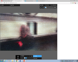
Despite this photograph being so blurry that you can't make out anything, I really like this photo. It looks quite eerie, because you can see that the subject is a figure of a human, but you can't make out any features on the face. The subject also looks quite ghostly due to the blur. There are a few leading lines that draw your eyes from the left of the photo to the right, but there is this spooky ghost person blocking the way, which makes them stand out more, possibly making it a little more disturbing. I think that this photograph could be improved by being a little darker, so I think I should increase the contrast, just to darken the shadows. I also quite enjoy how the most colour is brought in in one spot, further drawing your eye to this creature (no offence to whoever this was).

PHOTO 15
This is a photograph of a fellow student on this trip. He was taking a couple of portraiture shots, so I decided to do one of him. I think that I wanted to take this photo because I thought it would be quite cool to have a photograph of someone taking a photograph. He is also shooting film, which makes it that so much cooler. The colours in this shot are quite dynamic, where the lighter, bluish tones are far off into the background, whereas the darker, warmer tones are up front. This makes the subject stand out so much more. The expired film has caused this shot to be misframed, which is unfortunate. A crop should fix that nicely, however.

PHOTO 16
This shot was from the 10th floor of the Tate Modern, which is the top floor, where you are allowed to overlook the people wandering about their every day business. I wanted to take a few pictures from up there, because I thought I could capture Urban Life quite well by showing several people going about their daily errands from above. The ground that I have photographed here is quite unique, as there are many curves and odd swirling shapes created by the grass and the concrete. I also enjoy how the small people look in the photo, it amuses me for some reason. However, I don't really like how messy the photo looks. There are just a bit too many shapes here, I think that if I zoomed in a little with the lens, then the problem would've been fixed.

PHOTO 17
Here we have another shot from the top floor of the Tate Modern, however it is from a different side of the building. From this side, we can see a block of offices atop a restaurant, again with people scurrying around on the ground. What sets this apart from the picture above is that it's a lot simpler, and the lines created by the shapes in the building are straighter, and more uniform. There are also not so many colours, keeping it to the brown of the bricks and the interior of the restaurant, and the blue of the offices and the pavement (These were originally grey, but the blue was created because the film was expired). I also enjoy how intricate everything is. You can see inside all of the office windows, inside the restaurant, and even the pattern of the pavement. My favourite part of this photograph though is the solitary tree in between the buildings. The tree just looks a little lonely, and I almost feel a little sorry for it.

PHOTO 18
Here is the last photograph I took on the 10th floor of the Tate Modern. Here we have the same person in Photo 15, but in a different angle, showing the cityscape of London, with the Shard being the most prominent building. I feel that this photograph doesn't have much composition at all, but Rule #10 of Lomography says that I don't particularly need to worry about that. The colours are very similar to those of Photo 15, where the background is a light blue, and the foreground is full of dark warm tones, but the difference here is that the background takes up most of the picture here, whereas with Photo 15, it's the other way round. Where the film has expired, the photographs have got a significant amount of grain to them. The grain in this photograph has created a wonderful texture on the sky, making it almost look like a flat image. The only thing that I can see that is wrong here is that the cityscape looks a little tilted, so a small rotation should do nicely, just to straighten it out a bit.

PHOTO 19
This photograph is a little weird. The first thing that I noticed when I looked back on it is that there are 4 visible figures. There are three outside the room, and they are all wearing black trousers, and black jackets. The fourth figure is a silhouette in the darkened room. This photograph was also taken at quite an obscure angle, which can confuse the viewer just a little. Also, alongside the jaunty angle, the photograph is somewhat monotone, which likens it a little to a Rodchenko piece. Even though there are very little, I still enjoy the colours in this piece, because a lot of them link together somewhat. The skin tones of the three figures in the foreground look quite similar to the colour of the darkened wall in the exhibit, which then draws your eye to the fourth, silhouetted figure. The same thing happens with the black, where the darkness of the exhibit and the blackness of the trousers and the jackets are a similar shade of black. There is also a lot of text on the screen, with the 'LIFT & STAIRS' on the pillar on the left, the 'THE RADICAL EYE' on the wall, and the obscured text on the right. What's interesting about the 'THE RADICAL EYE' text is that the photograph was taken at such an angle that it's almost level with the edges of the photograph, which makes the text look straight. This creates a bit of discomfort when looking at the photo, because the text is straight, but the rest of the photograph is skew. Also, because the text is in the photograph, you are going to read it from left to right, which then forces you to see the figures in the photograph in a similar fashion, starting from the gentleman looking at something in his hand, to the silhouetted person in the dark.

PHOTO 20
This is one of the photographs where I specifically asked someone if I could take their picture. Thankfully, this lovely gentleman said yes, so here we are today. I think that the reason why I wanted to take this picture is pretty obvious, and it's because of the lurid purple that this person decided to dye their hair. I think it's a lovely shade of purple, personally. Anyway, this purple hair does well to stand out from the rest of the photograph, because everything else is pretty drab and boring, with people in the background wearing dull browns and greys, and the buildings being a dull brown as well. Another thing that is good about this photograph is subtle, but it draws your eye to the subject in the center. To the right of the subject is a sign that says 'Entrance' on it, with an arrow pointing to the entrance, but because of the way that the shot is set up, it's pointing at the subject.

PHOTO 21
This one is a nice, simple photograph. It's of people selling goods at Borough Market. The photograph is all brought together with all the reds that are used, and it's an overall pleasant photo. There is a little misframing on the left, but some cropping should fix it (The rest of the photographs also have a little misframing issue as well, but the same fix applies to all of them).

PHOTO 22
This is the last photo that I took that was a portrait. This guy served me Authentic Columbian Coffee, and his customer service was excellent. He looked like an interesting enough character, so I asked him if I could take his portrait. The scene that I captured here is quite full of character as well, with the cheeses on the left, and the bread rolls being sold on the right. We also have some bunting going behind the subject's head, with the word 'coffee' on it.

PHOTO 23
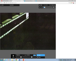
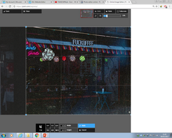
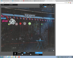
Last but definitely not least, this is a photograph of a coffee shop crudely (but hilariously) named 'FUCKOFFEE'. It amused me so much that I had to take a photograph of it, and the people inside (also, you can't really see it but there's a person outside as well). Even though the ISO really didn't let in that much light, you are still able to make out the intricate light fixtures, the neon sign, and the basic shapes of people. The way the colour shifted here is similar to Photo 2, where it looks like it's got a blueish tinge to it, making it look like I shot on Tungsten film a little. Combined with the fact that it's quite dark, it makes it look like it's night time (it wasn't, it's just a dark photograph).

Once this roll of film was finished, I moved on to my next one, which had 36 exposures on it. However, like I said, the film was so intensely expired that only 12 of the photographs weren't blank, but even then you weren't really able to see what was going on in most of them. I'll put them in a gallery below just because the format I've used above won't really work, as I can't particularly talk about composition or anything.
 |  |  |
|---|---|---|
 |  |  |
 |  |  |
 |  |  |
Now, all that was left to do was to edit the photographs. I opened up Pixlr, and began to make small edits to each one. I heightened the contrast and lowered the vibrance in every photograph (the colours produced by the contrast increase were quite lurid, which I didn't like), but there were a few edits where I had to make the odd brightness or rotation change, and I cropped a few photos as well, where the misframing happened. The results of these edits are below. (I didn't edit the second set of photographs, because the way they look is good enough already).
 |  |  |
|---|---|---|
 |  |  |
 |  |  |
 |  |  |
 |  |  |
 |  |  |
 |  |  |
 |  |  |
 |  |  |
 |  |  |
 |  |  |
 |  |  |
 |  |  |
 |  |  |
 |  |  |
 |  |  |
 |  |  |
 |  |  |
 |  |  |
 |  |  |
 |  |  |
 |  |  |
 |  |  |
 |  |  |
 |  |  |
 |  |
Plans for Final Piece
Now that I have all of my photographs, I can begin planning for my final piece. Below, you will see a mind map that I made, exploring different ideas.

As you can see, I only came up with a few ideas, but I feel as if they are pretty effective ones anyway. The first idea that I had was to have these photographs on slightly textured surfaces. I think that it would add a layer of depth to the photographs, and it would look pretty nice too. However, the problem with that is that setting up 9 projectors and 9 different displays would be quite expensive, and quite impractical as well. My next idea was to make a magazine with the photographs, but 9 photographs weren't really enough to fill a magazine. If I had all 24 photographs however, that would be different. My last idea, which is the one that I'm going to use for cycle 1 is to make an 8-page zine. I feel that this is a very good idea, as the zine won't be too big, it will have enough pages for all the photographs (minus one), and it will be quick and easy to print.
For my cycle 2, I didn't really come up with many ideas. However, I am happy with the one that I am going to choose. My original idea was to have them printed, but that would be very expensive as I have over 40 photographs, and they need to be printed off at A3 size minimum. With that out the window, I was going to go with the coffee-table book. This way, I can use all of my photographs, and they will all be presented nicely in one neat book. I can then also print off only a few of my favourite images in A3, saving me money. Getting the book professionally printed would still be expensive in itself, but I have people that can help me with the cost.
I suppose with all these ideas, I should get into researching them.
Cycle 1 - Zine Research
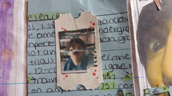
There was an article that I had stumbled across that taught me of the history and cultural significance of zines, which I think helped me understand them a bit. And, as a bonus, it even teaches you how to make one! I also looked a the Zine wikipedia page, as reliable as that is. What's great about zines are that they so easy to make, and even people like me can become an author, editor, art director, and a publisher, all because I photocopied a few zines. In fact, since photocopiers were new on the scene, zines have been extremely popular, especially in underground communities (1960's Sci-Fi, 1970's Punk, etc.). Another thing that I like about zines is that they can be anything that you want it to be, it doesn't have to be about anything specific. It's completely down to you what it's about. That's the thing too, they're usually about something so obscure and niche, because the more obscure things don't have popular magazines, so it's up to that person who is really into that niche thing to make the zine. I reckon that I will make my zines the quickest possible way, which I will get into below. There, I will make a practice zine about something, just to see how I get on.
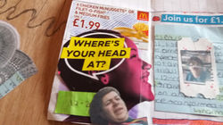
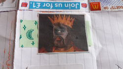
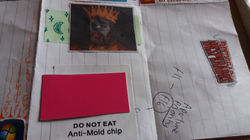
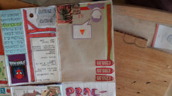
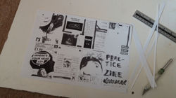
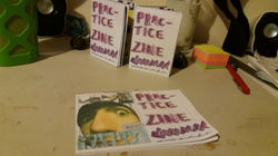
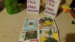
Since I was going to make this 8-page zine as easily as possible, I just pulled a sheet of slightly used lined paper from my bag, and began to fold it. First, I folded the page lengthwise, so that the longest edges met up. Then, I folded it again the other way, so that the shorter edges met up. I then folded it one last time in the same direction, resulting in a small rectangle. The sheet that I used was A4, so it turned out very small. I then unfolded it, and then began to cut the middle bit, so that I could fold it properly. However, I didn't have access to any scissors at the time, so I sloppily just cut the paper by breaking it down by applying a lot of pressure on it with a pen, resulting in a jagged, but colourful cut. I then folded the paper along the same line that I had cut, and then pushed in to the middle, which made it pop out. I then folded it, and there I had it, the blank zine. I began by doing the title page, with a highlighter and a biro. There was also a few assessment stickers next to me that were the perfect size, so I put one of them on the back page, as like a blurb sort of thing. Once I got home, I looked around my bedroom for old bits of scrap paper that I wanted to collage into the zine. I also printed off some old photographs that I had taken on my phone, just so I could add those in there. Once everything was ready, I sat down and prepared to cut everything out. Being left handed, I prefer to use an X-ACTO knife, wich allows me to have more accuracy. Once everything was collected and cut out, I began to stick in the bits of collage. I found this bit to be very entertaining, because I liked the sort of scenery I could create by combining different elements. Once it was all stuck in and finished, it was time to photocopy. Well, I sort of cheated here because I didn't have access to a photocopier. Instead, I scanned the whole unfolded zine onto a computer, and printed it out of a very old black and white printer, which gave the final B/W zines the appearance of being photocopied (they look quite similar to the 70s punk zines that I researched when they were done). Then, I cut off the excess paper with a small guillotine, and began folding, using the same process as I used before.
To get colour zines, I used the more modern printer at my mum's house, which has an in built scanner, and a copy feature which will instantly print what's in the scanner. Again, following the same folding techniques to achieve the same final product of the zines.
I ended up making 7 zines in total, one master copy, three B/W ones (each with a different amount of brightness and contrast), and three colour ones. I really did enjoy the process of making these. I loved the collaging and the scrapbooking element of making the master copy, and I even got enjoyment of simply folding the copies. Results of this little zine-scapade can be seen in the gallery below.
 |  |  |
|---|---|---|
 |  |  |
 |  |  |
 |  |  |
 |  |  |
 |  |  |
 |  |  |
 |  |  |
 |  |  |
 |  |  |
 |  |  |
 |  |  |
 |  |  |
 |  |  |
 |  |  |
 |  |  |
 |  |  |
 |  |  |
 |  |  |
 |  |  |
 |  |  |
 |  |  |
 |
Cycle 2 - Coffee Table Book Research
For cycle 2, since I had so many photographs, I decided that it may be a good idea to compile them all into a coffee-table book. Coffee-Table Books (also, more preferably known as Photo Books) are books that have photographs compiled into them. They're colloquially known as Coffee Table Books because these books full of photographs are usually placed upon coffee tables for people who are sitting on the couch opposite can pick it up and have a look if they're bored. You can also have them in shelves though, which is why it's probably better to call them Photo Books.
One thing that's massively important about Photo Books (besides the photographs inside) is the layout. This is how the photographs are placed on the page. In order to know what layout would look nice, I looked at Blurb.com, which is an e-commerce site that runs a service which allows you to print off books professionally, shipping them off to you once they're done. Another thing that they do on the site is they allow you to preview other people's books. They're mostly just novels, but you can apply a filter which lets you see the photography books, which is very helpful. I chose three photo books, and I had a look at how they were all laid out.
I picked out three photo books out at random, and took a look inside to see how each individual amateur photographer laid them out.
The first book I picked was a book called "PARIS EMOI", by a french photographer called 'Tardy Marq'. The way that this person laid their book out was quite different with most every page. A couple of pages had just one photograph on the right, whereas another page had one photo on the right, with a 2x2 grid of photographs on the left, which I found intriguing. There was another page which caught my interest, and that was the one of the pavement with the plants growing around it. The photographer mirrored the image on the other page, which created a very visually appealing pattern. Looking at this photo book has taught me to be creative with my layout, and not just keeping it the same throughout.
 |  |  |
|---|---|---|
 |  |
The second book that I looked at was a book called 'FUZZ', and it was by a multitude of different photographers that seem to be working together on something. This book also has different layouts for different pages, for instance, there's pages with isolated images, and then there's also full page images as well. I think that out of all three, I enjoyed the layout of this book the best. One thing that could do with fixing with this book is that is has a lot of text in the beginning, which is something you should cut back on in photobooks. The only text you should really have in a photobook is the title on the cover, and minimal information about the photographer(s).
 |  |  |
|---|---|---|
 |  |
The next book that I picked out is caled 'TOKYO 丁且 CHOME' . The book has very stunning black and white photographs, and a very intriguing front cover. The only thing that is wrong with the book is that the layout is exactly the same on each page, and that's where the photograph is covering both pages. In small quantities, I feel that using both pages for an image is useful, however I also think that if you use it too much, then it can be a little overwhelming.
 |  |  |
|---|---|---|
 |  |
With the research that I have conducted, I feel that I am confident in my ability to make my own photo book. I just need to remember a couple of things: to keep the text minimal, and some pages different. I will be making a couple of example pages in PowerPoint, and I will export it to PDF, and show it below.
I think that I laid it out very simply, but I don't think that it is boring at all. One of the reasons why I made it so simple is because I had trouble making the fancy layouts, so the only differences I made were the full-page photographs.
With Blurb.com, you can upload a PDF and they can print it off into a professionally made book (hardback, paperback, etc). This was the original plan for my final piece, however for my exam I must produce it myself in the 10 hours allocated, so I can't get someone else to make it and have them deliver it to me outside the exam time. However, I have another idea that will combine both, keeping the layout ideas of the photobooks, and the DIY ethos of the Zines.
FINAL PIECE
NOTE: Everything written underneath this red banner was written in exam conditions.
As I've said before, I plan to merge the two cycles for my final piece, making a home-made photo-book. I think that the Do It Yourself mentality that the Zines employ and the professionalism and aesthetics of the photo-book can co-exist in this project.
The first step that I took to create this potobook was to lay it out in PowerPoint. I did it similarly as before, but this time I made the smaller images a bit bigger, and there were a couple more full-page images. Also, I added a small amount of text at the beginning, just introducing the book. Once the layout was done, I went ahead and counted how many sheets of paper I needed. thankfully, since the PowerPoint was 40 slides long, I only needed 20 sheets of paper, since I'm printing the pages double sided. I am also going to print this book on regular matte A4 paper, for a couple of reasons. Firstly, I think that the gloss on the photo-paper can be irritating to look at when light is reflecting on it, because you can't fully see the image, because there will be a reflection on it. Secondly, regular matte A4 paper is readily available anywhere, which reflects the "anyone-can-do-it" mentality of the Zine community.
The only thing I had to do after that was print the book off. Usually, there is an option that you can select to allow you to print double sided, but that didn't appear to me, so I had to do it the hard way. I printed all of the odd pages first. So far so good, however I was quite worried that I would print the other pictures upside-down when replacing the paper later on. To attempt to remedy this, I wrote "this way up" alongside some upward facing arrows on a sheet of paper, and I printed a page off, just to see which way I should put the paper. Once I was confident in which way up I should put the paper, I put all the sheets back in the printer ready for printing once again, and this time I printed off all of the even pages. Once everything was printed, I had realised that something was off. I had in fact printed the even photographs upside down, as I feared. This means that I'm going to have to do something funky with the way that the book opens. Originally, I was hoping for the book to open like this:

However, I cannot do that now since some of the images have printed upside-down. If I kept it that way, then the right hand image would be noral, but the left hand image wouldn't be. With this in mind, I had to now come up with another way to open the book in a way so that all of the images will be the right way up. My first idea was to have another text page at the back, so then you could turn the entire book upside-down and see the image right side up again, but that just seems like a whole lot of effort just to read a photobook. My second (and final) idea that I had was that you take the bottom of the page and turn it over the top of the book, opening it somewhat like a calendar.

Now that that was decided, now it was time to glue the pages together. The Tutorial that I'm following was using things like a book binder, which I didn't have. Instead, I had to improvise. First, I made sure that all of the pages were perfectly aligned with each other. I know that the whole idea is that it's supposed to look home-made, but I still wanted it to be perfect. I then slightly dampened the edge that I wanted to glue, just to make the glue's bond with the paper stronger. then, I lightly applied glue to the side that I had dampened, and then stuck it underneath a bucket of emulsion paint (Brilliant White) to act as a kind of clamp. Then all I had to do was wait.
Once the waiting was over, I took it out from underneath the heavy bucket and saw that the pages were glued together, however they didn't seem too stable, so I had to add a spine to it. I took a blank sheet of paper and folded it to fit the glued edge. then, I applied a thin film of glue along the inside the spine and put the spine on it. Now, I feel that I can open the book without feeling as if the book will fall apart. Again, now I must wait until the glue has fully dried.
At this moment, I was presented with some book binding cloth. The photo book I made didn't yet have a cover, but that was all about to change. I cut out the front cover and the back cover, and I glued them together creating a nice cover. That was when I had the idea of printing a title on the cover. I attempted to stick the whole cover that I had made into the printer, but it just got jammed (Hence the black smudge on the back). I instead cut out another piece of book binding cloth and printed it out on that instead. The picture came out really dark, but it reminded me of how the 70's zines used to look with the way that they were printed, and it made me like it. I carefully stuck it on the front of the cover, and I think it looks great.
With that out the way, I glued the book itself into the cover, and it was complete. I just had to wait for it to dry.
 |  |  |
|---|---|---|
 |  |  |
 |  |  |
 |  |  |
 |  |  |
 |  |  |
 |  |  |
 |  |  |
 |  |  |
 |  |  |
 |  |  |
 |  |  |
 |  |  |
 |  |  |
 |  |  |
 |  |  |
 |  |
Overall, I think that I did quite well. The making of the book itself was incredibly challenging, but in the end I got a result that I am happy with. I do think that it looks just a little bit haphazard, but I think that it adds to the overall aesthetics of it being "homemade", just like the zines did. Also, I am very happy about how the inside of the book looks as well, it was laid out quite well if I do so myself.