


Abstract Art & Photography
1. Produce information about the concept of Abstract in Art and Photography.
The concept of abstract is an interesting one. In order for something to be 'abstract', it needs to "[exist] in thought or as an idea but not having a physical or concrete existence", or to "not attempt to represent external reality, but rather [seek] to achieve its effect using shapes, colours, and textures". So, for instance, I would use dark and deep colours and sharply angled shapes in order to represent anguish, or warm and pastel colours with rounded shapes to represent contentedness. Below is a series of 6 abstract painters and photographers that I feel are able to represent this idea of 'abstract' in their work.
Abstract Photography
Abstract Paintings
Philip Guston
 |
|---|
 |
 |
This is a series of my three favourite Philip Guston Paintings.
Philip Guston was born on the 27th of June 1913, and died on the 7th of June 1980. Guston was someone who helped lead the transition from pure abstraction into a more cartoonish representational abstract that rendered various personal situations, objects, and symbols (This could be why we see a few hooded Klansmen in some of his paintings, because he moved with his Ukrainian Jewish family to Los Angeles as a child to escape persecution, where they became aware of the KKK activities against Jewish people, amongst other minorities).
The first piece I want to look at here is Guston's 'Last Piece'. This isn't his last Abstract Expressionist painting, but it is more of a transition away from the shimmering forms of the early 1950s (see 'Zone') into his more recognisable motifs, like in his painting 'The Studio', or 'Head and Bottle;. I would say that what makes this painting abstract is the use of amorphous shapes and such in order to portray a concept.
The next piece of his that I chose is called 'Zone'. I think that this painting relfects this idea very well, with its suggestion of a warm calm with its mist of red hatch-marks which are concentrated in the center.
The last piece that I would like to talk about is called 'Gladiators', which depicts a fight scene. This painting represents something that he personally admired about Italian Renaissance art. This is also one of the first paintings done by Philip that includes imagery of hooded figures, which would appear in later works, such as 'The Studio'. This painting is less abstract than the others, in that you can sort of make out figures, but this is because he worked as a muralist with the WPA (the Work Projects Administration), so this painting is more of a move away from the more abstract, and more of a lean toward a social realist style.
Helen Frankenthaler
 |
|---|
 |
 |
Helen Frankenthaler was born on the 12th of December, and she died on the 27th of December in 2011. She contributed a lot of work to the history of postwar American painting, and because she worked for a long time (spanning several generations of abstract painters) she was able to create vital and ever-changing new works.
The first piece I'd like to talk about is named 'East and Beyond', which is supposed to depict an open space between a mountain-like divide. This painting was made by cutting thin sheets of plywood into seperately inked shapes, and then eliminated the white lines between those shapes while printing.
'Madame Butterfly' is the next piece I'd like to look at. This is an incredibly complex piece, involving 106 colours, and was made with 46 woodblocks. The white shape in the center could suggest the form of a butterfly, but instead it evokes a sense of delicacy, which is similar to the Japanese heroine of 'Madame Butterfly', a tragic opera written by Giacomo Puccini. We can also see Asian influence in the technique as well as the subject, the technique being called the ukiyo-e technique, where you print on a wooden block.
The last piece here is called 'Canyon', and was inspired by topographical features of landscape. This piece is also quite interesting as it shows the change from turpentine thinned oil paints to watered down acrylic paints that were poured into blots on the work. A quote from Nigel Gosling reflects this type of work from Helen perfectly; "If any artist can give us aid and comfort, Helen Frankenthaler can with her great splashes of soft colour on huge square canvases. They are big but not bold, abstract but not empty or clinical, free but orderly, lively but intensely relaxed and peaceful."
Wassily Kandinsky
 |
|---|
 |
 |
This artist was a Russian man who liked to paint. In 1914, he moved back from Munich to Moscow after the war. However, he didn't particularly like the Communist art theories, so he returned to Germany in 1921. After the Nazis closed the school where he taught from 1922 to 1933, After all of this, he moved over to France, becoming a citizen in 1939. This was the point where he produced some of his best works.
'Der Blaue Berg' depicts a vibrant blue mountain surrounded by a yellow and red tree either side. These bright colours and the thick dark outlines was to provide viewers with hope, as Kandinsky felt when viewing his favourite Russian Folk art, which this painting was inspired by. The horse riders are supposed to represent the Four Horsemen of the Apocalypse, inspired by Saint John's book of Revelation. These horsemen were supposed to represent the potential for redemption as opposed to the mass destruction of the apocalypse, however.
Kandinsky strongly believed that paintings could evoke sound, just the same way that music could evoke certain colours, or shapes. This is heavliy evident througn the next painting I would like to talk about, called 'Composition VII'. You can also see that this painting compeletely disregards any representation pictorially, as you can see through the swirl of colours and different forms. This links in with the concept of Abstract quite well, because this mass of colours and shapes are supposed to represent the theme of the cyclical processes of destruction and salvation. Also, you can see small glyphs of boats, mountains and people, however these were never meant to be taken literally, but instead were supposed to be visual references to the Last Judgement, the Garden of Eden, and the Deluge.
The last painting that I want to look at here is 'Composition VIII'. This piece can be seen as the complete opposite to the piece that I talked about before ('Composition VII'), because that piece employs natural shapes, where this is more geometrical. This painting contains elements of Suprematism (Art movement focused on basic geometric forms such as circles, quadrilaterals, and lines), and Constructivism, and the ethos of the Bauhaus, where he taught when painting this piece. This combination of all three movements works as an expression of Kandinsky's clarified ideas about modern, non objective art, especially the significance of circles, checkerboard, and triangles.
Aaron Siskind
 |
|---|
 |
 |
Aaron was an American photographer (Born 4th December 1903, Died 8th February 1991) who was closely involved with the abstract expressionist movement. His work focuses a lot of the time on the details of nature and architecture. He takes pictures of small parts of these to create new images and perspectives out of them, which stands alone from the original subject.
The first photograph here named 'Jerome, Arizona' reflects that, because it is a close up image of some peeling paint. This provides a completely new and independent image, which disregards the original subject and becomes its own thing. Siskind is prone to enjoy surfaces that resemble a canvas that an Abstract Expressionist painter might produce, hence this photograph (Aaron was also friends with a few Abstract Expressionist painters, which might have influenced his photography as well). This photograph links well with the concept of abstractness, because Siskind expresses his own inner feelings through his photography, and he lets the viewer determine what those feelings may be through the abstract nature of the photograph. You can also see that this photographer is still aware of composition, in that the darker flakes of paint are in the center of the photograph which is balanced by the lighter paint on the outside.
The second image (entitled 'Jalapa 66, from Homage to Franz Kline') is as the title says, an homage to a close friend of his, Franz Kline, of whom the thick lines of the graffiti reminded him of. This photograph is a little deeper than just an inspirational piece though, as this piece represents the differences between paintings and photography.
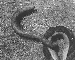
''Metal Hook' is the last image that I decided to write about here. Even though this looks like a photograph of an ordinary object, the nature of the photograph makes it abstract. The curvature of the metal hook and the rope is one thing that serves toward the abstractness of this image. Also, the close cropping of the frame in order to focus solely on the forms and shapes of the object. Alongside the high detail of the ground and the hook, these all come together to create an abstract photograph.
Edward Weston
 |
|---|
 |
Edward was a 20th Century photographer whom, over the course of over 40 years photographed many subjects, which included still lifes, nudes, portraits, and genre scenes. His career ended however in 1947 when he was diagnosed with Parkinson's disease. This artist has produced many works, but I will be focusing on two photographs that he took of vegetables.
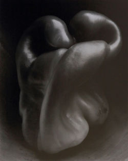
The first photograph, entitled 'Pepper #30', is part of a series of at least 46 negatives that he created of this vegetable over the course of 2 years, and this one is the most famous. The reason why I included it in this abstract segment is because it relies on the form of the vegetable in this state to relay messages. This is supposed to resemble two people intertwined, similar to Auguste Rodin's 'The Kiss;. Besides the bulbous bell pepper, there is also brush strokes visible underneath the legume, which creates textural interest.
Another photograph of his named 'Cabbage Leaf' is similar, where he uses the form of the cabbage leaf to create meaning. The raised spine of the leaf with the lines coming out of it created by the wilting of the leaf in contrast to the darker flat areas creates a suggestion of grace and movement.
Alfred Steiglitz
 |
|---|
 |
 |
 |
 |
 |
 |
 |
 |
 |
 |
 |
Alfred Steiglitz was an American photographer, who was adamant in the acceptance of Photography as an art form. He ran many art galleries in the early 20th century, and he introduced many avant-garde European artists to the U.S.
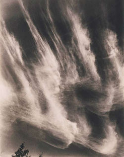
Like Edward Weston, this artist has produced many different works over the span of his photography career, but I will only feature certain photographs that align with the abstract ideology. For this, I will be featuring a few photographs from his 'Equivalents' series. This is a series of photographs that has captured ephemeral clouds that formed in the sky. Without the context that these are in fact clouds, the subject could be quite hard to figure out. However, the finding out of the subject isn't necessary, because the series is meant to represent the artists changing mental state. The artist would take pictures of clouds that he felt accurately represented how he was feeling at the time. This series is also considered to be the most abstract that this artist has ever been in his career.
2. Choose ONE of the following photographers to research.
The four photographers that I am required to choose from are as follows: Laszlo Moholy-Nagy, André Kertész, Edward Weston, and Andreas Gursky. My initial response to this selection is to choose bertween Laszlo and Andreas. The reason behind this decision is because I have already looked at Edward Weston previously, and I researched Andre Kertesz a little for distortion, so I will feel like I am regurgitating information rather than discovering new artists and photography. What's interesting about all of these artists is that they all play around with form and pattern in their works.
 |
|---|
 |
 |
 |
 |
 |
 |
 |
 |
 |
 |
 |
 |
Some of Laszlo Moholy Nagy's work reminds me quite a bit of Rodchenko's work, especially the photographs of the buildings. This artist's work was mostly shaped by Dadaism ("Artistic anarchy born out of disgust for the social, political, and cultural values of the time"), Suprematism, and Constructivism, the latter he had in common with Rodchenko, so I suppose that's where the similarity comes from. You can really see the constructivism in some of these images through the obscure angles, and the perspective lines.
I do quite like this artist's abstract photography, especially the photographs of the unidentifiable forms created by identifiable objects, like the paperclips or the shadow of the hand. This photographer also mostly uses close up images, really isolating the shapes which makes it more abstract.
Like I said before, I had already looked a little into André Kertesz for my previous cycle, but I had only really looked at his distortion work. There is still an entire plethora of work that he's done. For this, we'll be looking at his abstract work. This artist also employs the use of close framing in order to isolate forms to create meaning. For instance, the fork balancing on (what I assume to be) a plate is abstract because of the shapes that are created, like the shadow of the fork and the circular nature of the plate.
André was incredibly popular at the time, having even his earlier work published in magazines. This artist is still studied today because their work was groundbreaking, in that they were great contributions to composition and the photo essay.
 |
|---|
 |
 |
 |
 |
Edward seems to also use close up shots to portray form, notably so in the shell and vegetable images. For instance, the photograph of the shell that is side on almost reminds me of a kneeling person, slumping over with their head down. Even the image of the white radishes looks oddly and unsettlingly human. The other images (like the sand dunes, and the waves) rely more on close framing, to really isolate forms to alienate them from recognisable objects, into more abstract shapes.
 |
|---|
 |
 |
 |
 |
 |
 |
 |
|
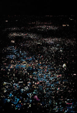
Andreas is the only photographer on this list to really utilise wide angle shots to capture abstract forms. This artist sometimes focuses on pattern, but there is also sometimes form there as well (Sometimes both, as shown by the photograph of the repetitive solar panels following the curvature of the hillside). Some of my favourite pieces that this photographer has done are of the ones from a long distance away, showing pattern in what looks like chaos. A great example of this is in the photograph entitled ‘Amazon’, where he has taken a wide angle shot of what seem to be books in a warehouse, and even though it looks like a mess at first, you can start to recognise similarities between each individual object, and after a while the whole thing becomes one big pattern. This is especially true for me when after looking at this image for a good minute or so I noticed distinguishable rows of items, where I could see lines going across, almost denoting order in what looks like at first to be utter chaos. This is what makes this artist’s work abstract, because even though you can sort of make out what the objects are, the photographer is using form, shape, and pattern to portray a sort of subtext behind the photograph. A similar effect can be seen in the photograph of the cows in their pens, although the grid pattern in the fences is a lot more recognisable and you are able to see it a lot faster. This image also denotes a similar message about order in what seems like chaos, because without these fences, this would look like just a big field full of cows scattered about the place, but with the grid-patterned fences we can see that there is order just by looking at the shapes that the grid creates.
 |
|---|
 |
 |
 |
 |
 |
 |
 |
 |
 |
I did particularly like how the photographer Andreas Gursky played around with patterns, and how Edward Weston captured form to represent different meanings. Even Laszlo Moholy-Nagy and the way he composed his shots to create subtext impressed me, but what really struck me was how André Kertész sometimes used the shadows to create new and different shapes, that are warped to create different forms. This is best seen in the photograph of the fork balancing on a plate, or what looks like a slicer of sorts on a textured surface. I particularly like these photographs because (in my head anyway) it could connote things that are hidden away, that are beneath the surface, or that are lurking in the shadows. I also find it very interesting how I went completely against my initial thoughts on this photographer, just by digging deeper and finding more out about him.
3. Take some photographs influenced by the artist you have researched, include both close-up and long- shot images. Present these directly after your research.
So this is the bit where I take photographs that are inspired by the photographer that I chose. I'm also going to have to be extra careful not to exactly copy his style though, they are only supposed to be inspirational. I think that when I am taking these photographs I am going to have to take into consideration the direction of the light, the angle of the shot, the item that will be casting the shadow, and the texture of the surface that the shadow will be cast on. I think that with all of these variables that can be played around with, this should make for an incredibly interesting and fun shoot.
Below are the photographs that I have taken that were influenced by the artist that I chose, André Kertész. These are not the final images however, since they have not been edited properly. Some effects that have come out of this shoot are ones that give character to these images I think. One thing is that the slow shutter speed that was used to intake the light (I didn't want to use the flash because that would flood out the shadows) creates this blurry effect that I quite enjoy on some of these images, some more than others however. The second thing was that the light that I was using (a torch) wasn't particularly strong, so the shadows that were created are even more formless and create some really ambiguous shapes, which really makes it all the more abstract. I tried to keep the shadows interesting by positioning the torch in different angles. Another thing that I am taking away from this shoot is that the refractions made by the glass objects look particularly wonderful, and might need looking into. One thing that I might do differently when I collect my second batch of photographs for this section (provided I don't decide to use black and white filters to keep it true to the artist) is to use coloured filters on the lights, just to make it a little different. You can see these images that I am talking about here below. Click on any one of them for a closer look.
 |  |  |
|---|---|---|
 |  |  |
 |  |  |
 |  |  |
 |  |  |
 |  |  |
I was quite happy with the result of these photographs, however I felt as if I could've taken them further. I chose 5 photographs that I thought turned out the best and experimented with them a little. The first thing that I did was to change the colour into black and white. I decided against using the filters as I felt that the black and white effect would accentuate the shadows quite well, and also keep true to the artist that inspired the pieces. To make the photographs black and white, I used an online photo editor called Pixlr. I used the express version, just because I only needed to make a few simple edits. The first thing I did for all of them was to change the saturation down all the way, to make the photographs truly black and white. Then, for all of them again, I brought the contrast up to 50%, to lighten the highlights, and darken the shadows. You can see the process below.
 |  |
|---|---|
 |

 |  |
|---|---|
 |

 |  |
|---|---|
 |

 |  |
|---|---|
 |

 |  |
|---|---|
 |

I think that this experiment went very well, I really like how bold the shapes and forms are that are created by the shadows. However, I felt that I could do a little more experimentation. I whittled down the favourites to three, and opened Pixlr back up. I went through different filters in the "Subtle" section in order to colour the black and white slightly just to see if there was anything I particularly liked. For the first image, I was just cycling through the different filters to see which different ones I liked. This meant that because the black and white saturation and contrast levels were the same, the filters would look similar on them. Below are the results that I came up with.
 |  |
|---|---|
 |  |
 |

 |  |
|---|

 |  |
|---|

These colours that I have added to these images have really brought them to life, adding emphasis and drama to them. I feel like no further editing is necessary, because they may end up becoming too complicated, and I feel like the simplicity of the shadows and the colours would be compromised. I have also decided to present these three photographs as my Final Pieces, because I feel that they are equally as good as each other. These are presented as bigger images below.


Out of all of these final pieces, I feel that the 'Stress' photograph is the strongest, but I also like how strong and amorphous the shadows are in 'Intimidation', and I love how dramatic 'Haunting' looks with the colours and the dark looming shadow.
The reason why I named the first photograph 'Stress' is evident if you understand the context of the book that I used. This book is a small A6 graph paper book from the French rental company Locatoumat, and I used to use it to organise my homework, into homework that I had done and didn't do (That's what the post-it notes are for). I don't need to use this small book anymore because I am mostly on top of my work now, but at the time (The beginning of Year 13) the massive weight of all the work that I was being given was getting to me, making me feel a little overwhelmed and stressed. I feel that the shape and form of the shadow being created by this book also reflects that well, because the pages had given a shadow that looks jagged and sharp, which looks as if it could hurt to touch.
The second photograph is named 'Intimidation' because the shadow that was cast by the plastic dragon (right) is much larger than the one cast by the plastic dinosaur (left), and it almost looks like a standoffish moment where the dragon is trying to intimidate the dinosaur. This one isn't as deep and insightful as the last photograph's description, but I still feel as if it is a meaning nonetheless, that perhaps other people may relate to in some way. That's the thing about abstract art, people are allowed to create whatever meaning that they feel fits the piece.
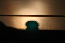
The third photograph is called 'Haunting' because of the looming and threatening pose that is created by the shadow cast by the tap. The first thing that is notable about this piece is that (for me anyway) the shadow reminds me of a 'past self', and how it could loom over someone and haunt them, just as the form of the shadow is doing. This is further supported by the fact that the original tap on the left is out of focus and blurry, which suggests a 'taking over' by the past self. Also, another thing that I noticed about this piece is that the shadow is being cast on a grid pattern created by tiles. A grid pattern usually suggests calm and order. Putting these two things together, a sense of how the 'past self' still haunts the subject, but it is behind them, and no one really minds it and everyone has forgiven them about it. But then again, that's just me, what do meaning do you see in all of these photographs?