


Typology

For this task, I have been asked to produce a typology piece. Typology is basically when objects are sorted based on similarities between them, like in archaeology, typology would be used to sort artifacts based on physical likenesses. This is a similar idea in photography, but in this case similar objects are photographed and put in a grid.


Some examples of typologies
The term 'typology' in the realm of photography was first used to describe a style incorporated into the work of the photography duo, Bernd & Hilla Becher. They had been documenting various run down buildings from similar angles and distances. "Their aim was to capture a record of a landscape they saw changing and disappearing before their eyes so once again, Typologies not only recorded a moment in time, they prompted the viewer to consider the subject’s place in the world."
 |  |  |
|---|
One artist that caught my eye when looking for inspiration for my piece is called Jeff Brouws, more specifically his Typology series. A lot of these typologies are quite natural in form, in that the shots weren't set up in any way, like the 'Signs Without Signification' or 'Surveillance Cameras' typologies. One piece of Jeff's that really inspires me however is his 'Twentynine Palms' piece, where he photographed 29 instances of signs indicating where there is a psychic in the vicinity. These pieces that I have mentioned here are pictured below, but I do not personally own these pieces, they are just here to show you what inspired me, not for any monetary gain. All rights reserved to the photographer that made these typologies in the first place.
 |  |  |
|---|
Another artist by the name of Steve Tyler has inspired me with his series entitled 'Typologies of Mass Consumption'. The reason why I like this series is because of how uniform everything is, it's oddly satisfying. Also, the large grid size of 81 images I think represents the aim of this series, to represent the mass consumerism lifestyle that runs rampant through everyone. Therefore, a large grid of images means the over-saturation of something, where a small 3x3 grid may represent obscurity.
 |  |  |
|---|
These artists, even though they do their work through the same means of typology, have a very different style. As I've mentioned before, Jeff Brouws's work has a more organic, natural feel to it due to the different distances and angles relative to the subject, whereas Steve Tyler's work is more mechanical and calculated as seen by all the items being the same size.
I think that my work will end up being similar to that of Jeff's, because I personally like the realistic aspect of it, however I also like the uniformity of Steve's work also, so I will potentially try to incorporate that into my final piece.
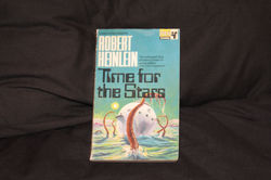
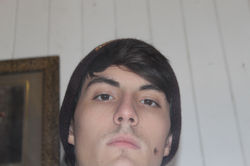
The aim of this shoot will be fairly simple, and that will be to photograph things that are similar. The real question is where and what I will be photographing. My first idea is to go into a shop in Maidstone town center called 'Trash or Treasure', as they sell a mixture of second hand and antique items. I think that this shop will definitely have some oddities that will be very curious and interesting to photograph and put into a typology piece. Another thing that I can explore is my collection of weird sci-fi books. I could photograph myself reading them with a close up shot of the front cover. This would then incorporate the natural feel of Jeff Brouws's work, because I will be in different positions reading these books.
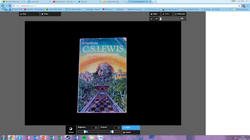
Obscure Sci-Fi Book Typology
For my first experiment, I gathered my collection of books off of my bookshelves and began to neatly place them on the floor to see what kind of grid I needed. The end result was a 5x4 grid, which was uneven, and I didn't particularly think that I wanted an uneven grid for this, so I knew that I wasn't going to at least use 4 of the books in the shoot. Then, once I was happy with all of my books I began the shoot. My set-up was a little strange, I had a lamp overlooking two pillows with black pillowcases on (the aim here was to create a black background). The result of this shoot is below.
 |  |  |
|---|---|---|
 |  |  |
 |  |  |
 |  |  |
 |  |  |
 |  |  |
 |  |  |
 |  |  |
 |
There were some difficulties with this shoot, mostly with keeping the book in the center of the frame and at the right rotation, but there was also a slight problem with the flash either creating a reflective shine on the glossy covers of the book, or sometimes brightening the background too much. I managed to overcome these difficulties through trial and error, meaning if I saw something that I didn't like in a particular photograph then I would re-take it. I'm sure there is a more efficient method of overcoming these problems, but I still made it through with some decent photographs.
After these photographs had all been successfully taken, I transferred them from my camera onto my Portable Hard Drive, and edited them using Pixlr again. For the majority of the photographs, I first applied an 'auto fix' to them, and then applied a brightness and contrast layer where I put the brightness down to -15% and the contrast to 50%. There are some photographs however that I had to heighten the sharpness a little bit, and rotate them a little to straighten them out. What came out the other side of this editing process was exactly what I was going for, a brilliantly detailed and vibrant book with an odd colour, with a perfectly black background (there was one photograph where some of the background made it through after the contrast layer, but I used an airbrush to get rid of it). The results of this editing process can be seen below.
 |  |  |
|---|---|---|
 |  |  |
 |  |  |
 |  |  |
 |  |  |
 |  |  |
 |  |  |
 |  |  |
 |  |  |
 |  |  |
 |  |  |
 |  |  |
 |  |  |
 |  |  |
 |  |  |
 |  |  |
 |  |  |
 |  |  |
 |  |  |
 |  |  |
 |  |  |
 |  |


After that editing was done, all that was left to do was to sort the photographs into a grid. I used Pixlr again, because they also have a Collage feature that allows you to combine pictures into one big grid. I opened it up, and chose 16 of my favourite book photographs, and thus the 'Obscure Sci-Fi Book Typology' was born.

In conclusion, I think that this typology piece went extremely well, even if it did go against my initial expectations for it. I originally wanted for this piece to be of me reading these books in different situations, but I suppose I was drawn in by the satisfying uniformity of these books (even in real life these books were orderly, they were all the same size). I also particularly like how vibrant all of the colours are that is incorporated in this piece, and I also enjoy how different everything is from one another, even in all of the similarity.
Antiques Typology
I could've just stopped there, I had a fairly decent typology piece that I easily could've just stuck with, but I decided to delve deeper and decided to employ a more natural method to typology by going into Maidstone town center and photographing things. I planned to abide by the work of Jeff Brouws, in that the shots mustn't be set up in anyway, I must employ a more carefree attitude to the whole thing. However, there was one major fault in my plan up until this point, I wasn't exactly sure what I needed - or wanted - to include in my other typology piece.
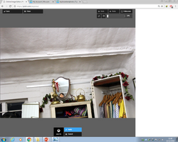
Once I had arrived at the shop, it became a lot easier to choose what I wanted to photograph, because I could actually see what was there. In the end, I ended up taking pictures of different bottles, cameras, egg cups, mirrors, vintage photographs, and little lead soldiers. This shoot was successful, in that I got all of my photographs successfully, but it was also quite tedious, because I needed to take so many of them. The result of this shoot is below.
 |  |  |
|---|---|---|
 |  |  |
 |  |  |
 |  |  |
 |  |  |
 |  |  |
 |  |  |
 |  |  |
 |  |  |
 |  |  |
 |  |  |
 |  |  |
 |  |  |
 |  |  |
 |  |  |
 |  |  |
 |  |  |
 |  |  |
 |  |  |
 |  |  |
 |  |  |
 |  |  |
 |  |  |
 |  |  |
 |  |  |
 |  |  |
 |  |  |
 |  |  |
 |  |  |
 |  |  |
 |  |  |
 |  |  |
 |  |  |
 |  |  |
 |  |  |
 |  |  |
 |  |  |
 |  |  |
Once I had taken all of my photographs, I compiled each category, (egg cups, mirrors, etc) and then made them into a grid using the same method as before.
The first set of photographs that I made into a typology piece was the set of bottles. I got the idea to photograph these when I saw a small crate of them underneath a table, as if they were some sort of family. I decided that this would be perfect for a typology piece. For the most of these initial typology edits, I have just lazily put them together without much effort just to see what I would like to improve the photographs on. What I like about the initial bottle typology piece is the fact that there are mostly the same colours throughout, (earthy browns) but there is also that light blue that is created by the glass. I also like how the pattern of the carpet is mostly the same throughout, however some of the bottles were different sizes, so I had to zoom out in order to fit the entire bottle in frame. Also, some of the bottles are different colours, which has had an effect on how the light is reflected back into the lens, which brightens the carpet in the background, which is a little jarring (pun not intended) in contrast to the darker backgrounds in other photographs. Perhaps I could edit the photographs to make them more uniform to replicate that appealing typology effect.

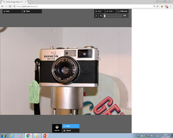
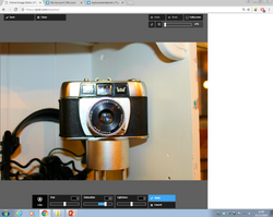
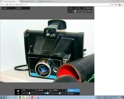
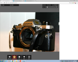
The next group of photographs I compiled into a grid were the vintage cameras. This was a fairly interesting collection of cameras, ranging from old DSLR cameras, others being even older polaroid cameras. I decided to employ some more obscure, natural angles with this one, mostly because I wanted to explore that style a little more, but also because I was a little scared to touch them in case I broke them. The end result is quite appealing in itself, for a number of reasons. Firstly, a lot of similar colours are being used in each photograph, each one using a rather greyscale colour scheme, however some photographs had a warm lighting effect to them, and others had little pieces of red and blue in them. I also seem to have accidentally shot some of the cameras facing in the same direction, with a lot of them facing down and to the left. I feel like this has given enough uniformity to be satisfying, all the while providing a little deviance. I do however feel that the colours are just a bit dull, so I could spice them up a bit in further editing later on.

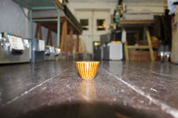
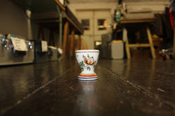
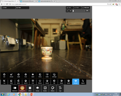
This next one I particularly enjoy purely because it amuses me a little. The reason why I shot these egg cups was a similar reason why I shot the bottles, all of these eccentric egg cups were just hanging out together in a basket, and I just started picking them up and photographing them. There was a specific method that I used to ensure that I got all the egg cups in the same position, and that was to line them up with a small mark on the floor, while I rested my camera on the floor, but holding it up gently as it is a little lens-heavy. This then gave me a background that is the same throughout every photograph, and the perspective-distorted lines created by the floorboards made a sort of zig-zag pattern between each row. One fix that I think could be used to improve this a little is to seperate the photographs somewhat, because the pattern that is made by the background is a bit ugly (especially with the lightness of the top of the photograph put harshly next to the darkness of the bottom of the photograph). I also think that we could draw the attention in a little to each egg cup, because at the moment they seem insignificant in the frame. This can be fixed later in post by adding a focal blur of sorts.

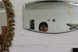
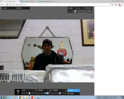
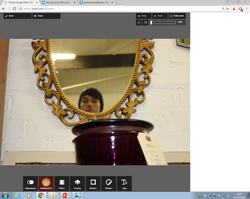
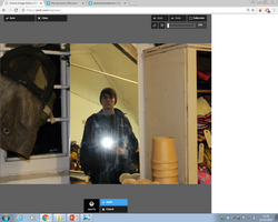
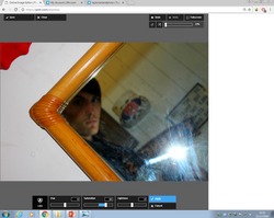
The next typology piece could quite possibly be my favourite. Not just because I'm in every photo, (even though that does play a major role) but because of the character of it. Around the shop there were assorted mirrors hanging up on the walls, so I decided to take pictures of my reflection in each one of them. In most of these photographs, I tried to avoid showing the camera in the mirror. I managed this by holding the camera at a low position, and pointed the lens to look directly at my face, but through the mirror. This way, the camera couldn't be seen, and I am looking dead on at the camera. Sometimes it was unavoidable though, some of the mirrors were body mirrors and showed a reflection of my entirety, and other times there wasn't enough of me in frame so I had to raise the camera a little. Also, I added a separation of 20 pixels between each photograph because of a similar problem with the previous image, the images were jarring when put up directly next to each other. One thing that I could say about this piece that needs improving is the vibrance of the colours, there is a bit too much beige/brown colours in it, with only a few photos having bits of red or purple. Then again, the naturalness of the photographs is also appealing.

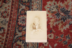
For my next piece, I took 32 vintage portrait photographs and re-photographed them. This is a very effective typology piece, in how the whole thing is laid out and how each of the items are similar but disparate enough for you to notice differences in them, however I feel that it is almost identical in layout as my Sci-Fi book typology piece. This can be seen through the rectangular subject in each photograph, which plays an important part in the similarities between each photograph. Another thing that I find annoying about this one is how boring the colours are. They are the exact same in each one, with a red carpet in the back with a sepia toned photograph as the subject (with the occasional black and white photograph). This problem could potentially be fixed if we took the focus away from the background, by either darkening it, or blurring it out. Otherwise, I kind of enjoy seeing the faces of each person that lived an entire life and died way before I was even born all compiled into one big typology piece.

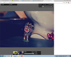
This next piece would probably be the safest option for me to choose if I needed a final piece quickly. All 9 mini-figure soldiers are made of lead, they are all in the same position in the frame, and they are all pointing in the same direction. The way that the background is the same in each photograph also works well for this piece. There isn't much that needs fixing in this one, the only problem was that the background put together without the separation looked a bit nasty, but that's fixed. Perhaps I could add some deeper meaning to this piece through colour grading or something.

With each first stage compilation out the way and there were some clear improvements that were needed to have been made, I set out to begin fixing the issues with Pixlr.
First of all, I edited the photographs of all of the bottles. with each photograph, I changed the levels of the brightness and the contrast of each one so that the shade of the background more or less matched in each photo. Also, I changed each photo to have no saturation, so that they are black and white. This allowed me to see if the background matched better, but then it also took away from the excitement of the earthy browns and the bright blues of the bottles. Furthermore, the brightness/contrast editing job was a little shaky on my part, which you can see in the background of the images, where the dark areas of the pattern vary in shade. Overall, I would say that this is an effective piece, but it isn't my best by a long shot.
 |
|---|
 |
 |
 |
 |
 |
 |
 |
 |
 |
 |
 |
 |
 |
 |
 |
 |
 |
 |
 |
 |
 |
 |
 |
 |
 |
 |
 |
 |
 |
 |
 |
 |
 |
 |
 |
 |
 |
 |
 |
 |
 |
 |
 |
 |
 |
 |
 |
 |
 |
 |
 |


With this next set, I did as I said I was going to, and heightened the saturation on each photograph. The result of this surprised me a little, as it made the Typology look quite retro, and is reminiscent of the 1950's in the bright colours. This goes quite well with the subjects of this shoot, which are old, retro cameras. This all went well for this piece, but I also feel as if it isn't my strongest.
 |
|---|
 |
 |
 |
 |
 |
 |
 |
 |
 |
 |
 |
 |
 |
 |
 |
 |
 |
 |
 |
 |
 |
 |
 |
 |
 |
 |
 |
 |
 |
 |
 |
 |
 |
 |
 |
 |
 |
 |
 |
 |
 |
 |
 |
 |
 |


For this next bit, I took on board what I said about what I wanted to fix about the typology piece, and I did it. I applied a focal blur on each egg cup, and I even divided the photographs. Again, I don't feel too strongly towards this one, even though it is pretty fun to look at.
 |
|---|
 |
 |
 |
 |
 |
 |
 |
 |
 |
 |
 |
 |
 |
 |
 |
 |
 |
 |
 |
 |
 |
 |
 |
 |
 |
 |
 |
 |
 |
 |
 |
 |
 |
 |


Again, I just did what I said that I wanted to do, and changed the vibrance and saturation to different levels, depending on what I felt that the photograph needed.
 |
|---|
 |
 |
 |
 |
 |
 |
 |
 |
 |
 |
 |
 |
 |
 |
 |
 |
 |
 |
 |
 |
 |
 |
 |
 |
 |
 |
 |
 |
 |
 |
 |
 |
 |
 |
 |
 |
 |
 |
 |
 |
 |
 |
 |
 |
 |
 |
 |
 |
 |
 |
 |
 |
 |
 |
 |
 |
 |
 |
 |
 |
 |


Like I said before, all I wanted to do for this was add some spaces between each photograph, and add a blue filter. I did so successfully.
 |
|---|
 |
 |
 |
 |
 |
 |
 |
 |
 |
 |
 |
 |
 |
 |
 |
 |
 |
 |
 |
 |
 |
 |
 |


Now that I have finished the editing part here, it is time for me to choose a favourite. Unfortunately, the bottle piece had to go first. To me, to put it bluntly, it looks the ugliest out of all of them. Similarly, I'm not too particular about the eggcup piece because I'm not too sure about the colours of the background. I think if I focused more on the eggcups by zooming in on them more then this problem would be fixed, but, the problem persists, therefore this piece must go. I think that the soldiers piece works very well as a typology piece, but it is a bit too simple for my liking. On the contrary though, the mirror piece is very busy and cluttered, and even though I like it because of it's character and it's natural angles, it needs to go. This leaves us with the camera piece, which I guess is the victor of the battle of the pieces.
Much like a boss battle in a video game, I must put the victor of the previous battle (the camera piece) against the big guy, the Obscure Sci-Fi Book Typology (the OSFBT for short).


VS.
For me, the choice is very simple. With the camera piece, not much effort was put into it. Even though it does look aesthetically pleasing, it also does look a little sloppy, where the OSFBT looks very neat, and organized. I also prefer the wide viarety of colours that you can see on the OSFBT, whereas you are limited to only a few on the cameras piece. Lastly, there is more viarety in the OSFBT in general, with the images on the books themselves, whereas the cameras piece only has cameras on it.
Overall, I feel that the OSFBT is the stronger piece, and therefore, the victor of the editing battle loses the boss battle, and the boss wins. Game Over.
My final piece can be seen below, just click it to enlarge it.
