


Traces Project
- Taylor H
- Apr 11, 2019
- 4 min read

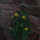
The first photographer I looked at was Gabriella Héjja, more specifically her work on surface and texture. Titled 'Traces of Time', it is a perfect example of work that shows the theme of traces. It beautifully conveys the effect that time has on things, and how that translates into a physical texture that can be perceived in our own concept of time. I enjoy how ambiguous these images are, because they give you absolutely no context as to where and when they were taken, all you are left with is the visual representation of how over time it has changed. I think that this theme is very interesting, and might be worth pursuing for the final piece.

The next photographer I researched was Joel Sternfeld, because his work (especially 'American Prospects', which I looked at) is a perfect example of documentary photography. First of all, I really enjoyed the urban landscapes that he was shooting, so I wanted to photograph some as well in my work. Joel's work is also very intriguing because there are many components, therefore it is interesting to look at. Joel's work is ambiguous as well, something which I took forward in my work.

I knew that I wanted to pursue the theme 'passing of time' from researching Gabriella's work, and I also wanted to shoot in an urban landscape style because of Joel's work because of the research I did, so there wasn't really much in the sense of idea generation. I also wanted to keep the meaning and the context fluid, have lots to look at in the photos, and link the theme to what's in the image as well.
Contact Sheet:


I chose 7 photos from the shoot to be my final pieces. The first photograph is of a barrier put up by workers. One point of interest is the people on the top right corner. I usually try to avoid taking photos with people in them because I find it to be more ambiguous without them. There is also scaffolding towards the middle, some manhole covers on the pavement, and more obviously, the big red barrier in the middle. This photo shows the passing of time because there are three instances where time has deteriorated something, and now someone has had to put up structures and measures to make sure people are safe because of it.

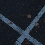
The next photo is of some road markings next to a pavement. This shows the passing of time because of the cracks in the paint, and the leaves collecting at the bottom. The cracks add age and character to the paint, and the leaves are a symbol of autumn and winter, which is part of earths cycle around the sun. I enjoy this image because it is a very simple yet abstract way of conveying the theme.

This next image has buildings in the background with dirt and grime building up underneath the windows, and a shop front which has been completely opaqued with white paint, which suggests that the shop has shut down. I know for a fact that the shop has shut down, because a month after this was taken it was reduced to a pile of rubble. Another thing to note are the red subjects in the foreground acting as barriers, similar to the first image we talked about.

This photograph is practically the same as the second photo we looked at, because it deals with cracked road paint and dead leaves, except this time it's in a car park and not the side of a road. I liked this photo (and decided to include it) because of the composition mostly.

I chose this next photo because of the several points of interest. The street name sign, the arrow sign, and the traffic cones at the bottom of the frame. What is also a major part of this photo is the wooden scaffolding and the closed down store in the background.

I ended up choosing this image because it's a photo of scaffolding, and we already seem to have a theme going. I also enjoyed the geometry of the scaffolding, and how the yellow stood out from the rest of the image. I also like the look of the lights from the cars in the top right corner.

Last we have my favourite image, the one of the building. The reason why it's my favourite image of the bunch is because of the composition, simplicity in colours, and the several little details that are all interesting to look at. For instance, the bent railing by the door, multiple visual signs of excessive use, the scaffolding. and a shattered window.

After going through the images, I decided to pair them off with each other. I think that this made the visual communication a lot stronger as it will be easier to notice similarities and patterns that way.
I paired these images because of the temporary structures put in place for harm reduction purposes, and both the shops are closed.


I paired these two because of the manhole covers, red subjects acting as barriers. and the lights in the upper left.


I paired these next lot because they're practically the same image, just moved around a bit.


And lastly, I decided to have the photograph of the building as a standalone image, because I think that it is more unique than the others so it doesn't fit in with any of the other final images, and as I've mentioned before, I liked the three main colours that the image employs, which no other image does.


I think that overall this project was successful. I reckon that the photos reflect the theme of the passing of time quite well, and they are all quite visually stimulating. I think that if I were to improve on this I would like to do more than just one shoot in more than one location to provide the variety that I think it needs.


Comments