


Experimental Practices (draft)
- Taylor H
- Nov 9, 2020
- 21 min read

Updated: Apr 3, 2023
Experimental Practices - What it's all about and initial ideas
Chris McCaw
I did a post about McCaw for my foundation in Art and Design at UCA Rochester, and although my writing has changed for the better since then, I won't bother re writing the same stuff here. I like that Chris's work shows the direct physical relationship between his medium and the subject, as it burns an arc in the photo-paper. I am interested in the same idea, where taking images of things that affect the thing taking the image in such a way that that affection affects the final image.
Cyanotype & Argyrotype Workshop
I had brilliant fun with the Cyanotype & Argyrotype workshop. This was the first time doing anything like this, and I felt like I was having fun with my practice which is refreshing. It didn't take long to get going as the process is fairly simple, so we got going. I printed out an A6-ish size negative image I took of my brother a few years ago on acetate and brought it with me, because I thought he would enjoy seeing himself as a print. We started out with cyanotypes, which I am in love with. The rich blue is so pure and deep and it resonates with me for some reason.


I think these turned out great for a few test prints. I scanned them with a flatbed scanner once I got home at 1200dpi, just so I could get the details in the material I printed on, but unfortunately this website compresses images in those galleries, so you won't get the full effect here. After scanning them at high detail, I noticed that the cyanotypes picked up on the pattern of the way inkjet printers print, which is completely invisible to the naked eye (or to mine at least) when viewing the physical print.

It seems obvious because we did contact prints, but as someone who has only used cameras before this (apart from doing photograms and such) this level of detail seemed ridiculous. I also enjoyed the idea of using digital images and digital prints with an old process. Combining the two gave me a post-internet vibe, which I have been into recently after my AI project for Vision and Knowledge and looking at Jon Rafman for my term one essay this year. This concept might be good to look at in the future, as I want to try different digital cameras that have artefacts and glitches which would look interesting on a cyanotype; a medium not well known for visual errors.
We also looked at Argyrotypes, which is pretty much the same thing except you need a fixer and it's brown. I liked this way of doing things as well, because that rich brown is very reminiscent of old Victorian era photographs.


As you can see, I didn't get too many of these done. That was because I had a much better idea that was worth experimenting with instead. Tie dye! I've been obsessed with tie dyeing things for a long time, so when I was allowed to start using cloth I hopped on the opportunity pretty quickly. The procedure is the same as always, twist the middle of the cloth tightly, and tie off sections making sure the knots are tight enough to not allow liquid in the fibres.


I put the negative on top of the cloth in the holder, and exposed. After I thought it had been in long enough, I washed it in water, and out came a very interesting cyanotype indeed.

Originally, I thought that the brown spots were extremely saturated cyanotype spots that didn't expose properly, and was so thick that it didn't wash away, but Peter told me that it seemed like some argyrotype had made its way on, either through contact in the drying rack, or an argyrotype spillage where I was preparing the tie dye. Either way, it looks pretty cool. I saw how the cyanotype and argyrotype seem to reject each other, resulting in a white halo around the dark brown spots, and immediately wanted to try it again.
This time, I made a base coat on the cloth with argyrotype, dried it, and applied a small amount of cyanotype in the center of the spiralled cloth.

It looked like a different type of tie dye as well (I had applied further cyanotype to two quarters that I had divided the cloth into for the first one, but this one I applied it in the center), which I think achieved a more interesting effect.

After exposing it, I already thought it looked superb. Since it was mostly argyrotype, I decided to use the method of fixing and washing away the excess as if it were purely argyrotype. I was concerned that the cyanotype would be destroyed in this process, but it held on like a true champ.

I absolutely adore the blue spidery legs spinning out from the centre. It adds an element of excitement and interest where there would have just been pure brown. I also enjoy where you can see that the image has exposed on the tie dye patterned bits, showing that it is indeed two photosensitive liquids being mixed together and not just fabric dye.
I had immense fun with this workshop, and I think it would be possible that I would go forward with cyanotypes and argyrotypes, and I would also like to venture deeper into the world of tie dyeing these chemicals together. I think that this effect would work brilliantly on apparel, using images printed on A3 bits of acetate. Just something to think about.
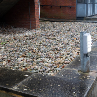
Vintage and Experimental Cameras Workshop
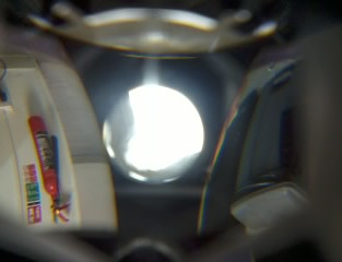
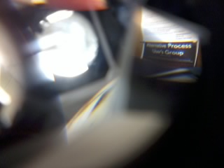
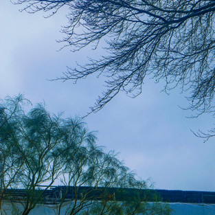
The vintage and experimental cameras workshop was fun, although a little underwhelming for me. Unfortunately, I had to help a friend out with a 35mm camera the whole day, and I had to leave soon after so I didn't get to experiment at all with any of the cameras that were available or get the full experience with this workshop. Given this situation however, I decided to experiment with some digital cameras. The camera I used was the one on my old Samsung Galaxy Y, which I had when I was younger. I also brought two point and shoots with me, but one ceased to work and the other only powers on if it's life support (the charger) is still connected. While I was helping my friend out with her camera, I was taking photos on the phone. I was excited to try this out again, because there is an option for 0.1 Megapixels, resulting in a 320 x 240 px image. For someone who wanted to explore bad digital cameras, this is pretty much the gold mine. While shooting throughout the day, I picked up on some digital effects that I can achieve.


The first thing I noticed about this camera is the way that it get overwhelmed with light. For instance, the first few images have the sun blowing out the sky completely, which gives the areas of pure white an almost heavenly, glistening effect, as if it was shot with a high aperture and a soft focus. The lens flares are quite interesting as well, introducing some new colours to the image.
I also tried to see what would happen if I put too much light into the camera, and it resulted in dark lines. This is because I shot those under flourescent lights, whereas the others were shot in natural daylight.
I quite enjoyed stress testing this camera out in terms of what it does with too much light, it would be worth doing the same tests with my other digital point and shoots, if I can even get some of them to work.


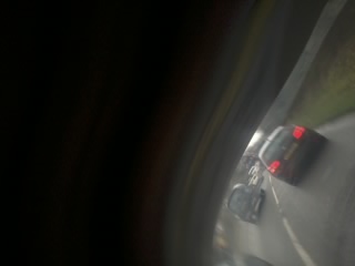
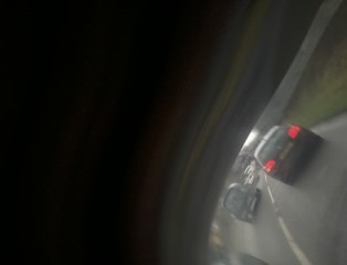
The second cool thing I found was on the way home from the workshop. I saw that there was a short delay between the press of the button to the recording of the image, so I tried to get some motion blur shots. Later on when I looked back at the photos, I saw this odd warping effect. I think that this occurs because digital cameras don't take pictures all in one go, they take images in rows of pixels in short succession. This results in a warping effect because the subjects are in different positions from when the columns started being captured. I think that these are really nice, and the wobbliness of the photos pair well with the low quality.


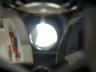


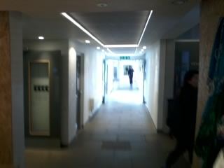
I had also brought with me a telescopic lens designed to be used for mobile phones, hoping to build a box camera with it, but since that didn't happen I decided to use it for it's intended purposes. At first, I used it like any normal person would: taking images that are zoomed in. I couldn't find the little clip that holds the lens in place before I left the morning of, so I just held it in place. Because of the hand-held nature of what I was doing, I couldn't keep the lens and the phone still (they are both tiny!). This gave me some excellent motion blur in places, and some beautiful lens distortion (most prominently seen in the first image above). I also tried reversing the lens, and I got some interesting 007-esque photos of a corridor. The light gets so focused this way however so you don't get any definition in the small circle, rather vague figures and colours. This lens also had the ability to be taken apart, which I did. After opening, a system of mirrors (that I can only assume aids in magnification) fell out. I thought I had broken it, but after realising it could be put back together with ease I took it out again and shot with it in front of the camera. I found this fascinating, as the many mirrors brought many perspectives to one image.
Also, for this workshop, we were asked to bring in any old camera that we wanted to use/discuss. I brought with me a Nikon Pronea S. This was an old camera belonging to my parents, and it still had some film in. Also, I brought in some odd shaped film canisters that I found, hoping to ask about them to figure out which camera they should be reeled into. I later figured out from the handbook that I was in possession of APS film, which is a completely new format I hadn't heard of until this workshop. I also found out that the camera that I had brought in was the camera that my parents shot this APS film on, so all I have to do now is buy some CR2 Lithium batteries, and I can do an experimental shoot with this now defunct format. Part of me hopes that this APS shoot goes horribly wrong so that I don't feel so bad that I can't buy the film anymore, but I always enjoy shooting film of any kind, and it's probably going to look pretty cool seeing as this film has to be 20+ years old. Alongside the reel that's already in the camera (I opened the flap that you put the film into before abruptly discovering it, but it doesn't let you open it all the way if there's film in there as it obscures the opening, so I don't think I did much damage), I have one completely unexposed reel, and one half-exposed reel. I just need to think of an idea for a shoot now that isn't complete rubbish.
APS
- Shoot
Once the CR2 batteries arrived, I was pretty excited to try the Pronea S out. Immediately I was greeted with one of the selling points of this format: it winds itself. Nice touch, especially for people like me who aren't very gentle with film. I just walked around my local area and this 'Shoot Route' I've adopted which starts outside G32 and loops around on itself so I end up back where I started, ready to work with the images I just shot in the workshop. The camera was very easy to use, as I didn't mess around with any settings. I also learnt that the feature where you can choose between 16:9, full frame, or panoramic is essentially pointless (it just puts information on the rebar of the film to tell whoever develops and scans it to crop it in a certain way), so I didn't use that either.


The most difficult part about shooting in this format is the developing and scanning. The place you were supposed to go back in the day were high-street developers, because they would have the necessary equipment to handle the 24mm format. However, along with the format, the equipment also became obsolete. Some developers still have this equipment, but I didn't want to pay for it. Instead, I learnt how to open one up and used the C-41 machine instead. Of course, this isn't the intended way of doing it at all as APS film was designed to be developed in the canister, but again I didn't have the correct facilities for it so I just treated it like 35mm film. The scanning was also hard because there weren't any 24mm film holders, so I had to apply a weird mixture of tension and balance inside of the holder in order to get a sharp-ish image.
Further 0.1mp Camera Shoots & Testing
- bit on the phone camera lenses
Vivitar Shoot
- Testing different resolutions and choosing fave (5mp)
- Comparison to Galaxy y
- Shooting on the train to London
- The need to remove IR filter
- Editing
Olympus 35mm PAS
- Shoot
This camera is a cheap 35mm point and shoot I found in a charity shop. It winds the film itself, and there's even a little light indicating that the flash is powered. That's as fancy as it gets however, as there are limited settings or parameters to change. This isn't a bad thing necessarily, as I believe that limitations breed creativity, especially in this case. Much like the Nikon Pronea S, there was already a roll of film in the camera. I did find this out opening the back of the camera (a few times...) unfortunately, but the light leaks should look interesting at least. The aim of this shoot was to just test the camera out, and to see what the images look like coming from it. I was shooting on Truprint 200 colour film, by the way.
Before we get into the images, there was something extremely irritating that this camera does that was constantly getting in the way of the flow of the shoot. Sometimes, the camera decides to wait somewhere between five minutes to a couple of days to activate the winding mechanism, which meant that if I was out on a shoot and it didn't feel like working, I would have to wait until it was co-operative before I could take another photo. I feel like I could spin this whole faulty mechanism into a positive gimmick though. Joel Sternfeld could only afford to take one image a day on his American road trip, which taught him patience and to truly consider whether a moment was worthy of his one shutter release of the day. This is a watered down version of that, where it reminds you of the fleeting nature of moments. You might witness something that you reckon deserves to be captured, but the camera might not allow you to reframe it, putting up its proverbial middle finger and telling you that nothing lasts forever.


The images from this camera are fine, nothing I haven't seen before. Since the lens is just a meniscus lens, it has a similar depth of field as many other point and shoot film cameras. Similarly, it has similar troubles with under-exposure in low lighting, as the camera has a slider for either 100/200 ISO, or 400 ISO. The film I was using was 200 ISO so I chose the former setting, but obviously it doesn't do as well in indoor environments. The light leaks look cool as I thought they would, but that's nothing to do with the camera.
I also decided to edit the few images that were somewhat salvageable, and I got a decent result with the practice I've been getting with this unit. As I've mentioned before, I don't want to edit the final images I produce, this is just me experimenting and practicing editing photographs. I did the same procedure I went through with the rest of these shoots; if an image looks too green/pink then change the tint, and if it's too blue/yellow then change the temperature, and move around the other sliders to taste. The only difference with these ones is I added 'Clarity' to each image, which seemed to bring out a little more grain and increase contrast. I was just testing it out, and I think it actually looks quite good with these images.


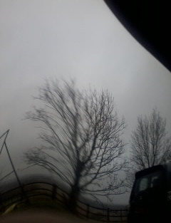
Taking Photos of the sun - making images that show the direct relationship between the light and the instrument that is recording that light (Digital Chris McCaw)
Poor Image Research
Scanography Workshop
This workshop was a blast. I didn't know I could spend so much quality time with a flat bed scanner, but this goes to show that anything is possible. The premise for this workshop isn't too difficult to follow, we just scanned things. The demonstration given at the beginning was how to get a technically perfect image, but after a while I just messed around and hoped for the best, like I usually do. I bought in several different items to scan, and spent the whole day making digital copies of things. I edited these quite dramatically, and I put a grain on each image to give it a uniform texture.
One item that I bought in that was a muse throughout this workshop was a little piece of cut crystal (not entirely sure the mathematical name for this the shape). The way that the light refracted through the piece created fun colours that I could stare at for hours. There is also something very 80s to it that is very appealing. The way that the scanners picked up all the little bits chipped off and the thumbprints that fascinates me.


I also wanted to try scanning my face. for the first three images, I chose a small section on the scanner to scan and placed my eye in that section as best as I could. You can see tears forming in a few of them, because the scanning arm was so bright. I managed not to blink though, even if the eyes were moving about a bit. The last two were the results of me pressing my face against the glass and scanning the oil print my face left. I think that it is very interesting that you can still make out a face from the imprint alone. I also tried just black and white for this, as I heard that you can get a sharper image because the scanner doesn't have to bother with RGB values.


For this next set, I wanted to focus on the form of the hand. I think that this series is visually strong because it messes with this universally recognisable symbol; the hand. I took something that has no understanding barrier (everybody has a hand), and made it less understandable. This also works in the black and white realm, as it simplifies the image down to just two highly contrasted values. I also had a small holly branch with me so I used it to fill in some space.


These are just some assorted scans I did with no particular avenue or theme. These are just experiments in moving things around, colour editing, and practicing getting a perfect image. I tried to get images that were as technically sound as I could so I knew which boundaries and conventions to mess with. Once you know all of the rules you can bend each one to see what it looks like.


I think that the thing I found the most fun was the gratification I had once the highly detailed scan had finished and popped up on screen. I think that scanning (besides infinity table photography) is one of the only ways to truly remove an object from it's context, turning it into something existing in a void with absolutely nothing else. Also, the textures and detail that you achieve from using a high DPI is amazing. Scanning is one of those processes that I could spend all day doing. I think that I would like to try doing more scans of my hands or other bodily forms, as I think that distorting the body in such a way that's achievable through flatbed scanners is quite powerful. I have a scanner at home, but it is nowhere near as expensive and quality as the ones at uni. However, I think that the lower quality plays into my whole 'Poor Image' angle quite well.
Liquid Light Workshop
- Giving up and doing more Cyanotypes with images I made for scanography workshop
This workshop was a little redundant for me, since I maybe attempted two liquid light images the entire time. I failed horribly both times, and just went back to doing more cyanotypes. I selected four images taken on the 0.1mp camera that I thought would work well in the cyanotype medium, and printed them on acetate to create some digital negatives. I also took my favourite scanned hand images from the scanography workshop and made A3 digital negatives with them to try and make some bigger prints.


SCAN - Cyanotypes
PHOTOGRAPH - A3 cyanotypes and pillowcases
WRITE - Write about each scan & what you used - how you feel about each effect
The workshop was fun overall, I experimented with several different things (well, anything I could find in the chemicals cupboard in the mounting room) which I think resulted in great results.
Screen Printing Workshop
- The idea of doing halftone photographs with screenprint
- 1st attempt, didn't know how to make the DPI smaller so I just ended up printing the image
- tried cymk too
SCAN or PHOTOGRAPH - Screen Prints
WRITE - What you liked and what you want to do next


Digital Colour Space Workshop
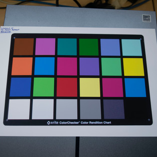
For this workshop, we messed around with colour checker charts and colour profiles in photoshop. The way that colour checker charts work is simple; there is a grid of colours that is recognised by a particular piece of software (called Colour Checker Passport) that takes these colours - which are supposed to be the "truest" colours - and creates a colour profile that can be used in photoshop. The chart is meant to be photographed (in RAW) under the lighting conditions you intend to shoot in so that it can work out the lighting and "fix" it to make the colours more "real". As you can see, I'm putting many quotation marks around the words that indicate that this process is to make the photograph "perfect", because I think that striving for the "best" image is boring, and elitist. This workshop was perfect for that however, because it takes part of the process and messes with it. The whole idea was to change the colours on the charts around so that different colour values would be translated differently, resulting in greens turning to blues, or reds turning to pinks.
The first thing on the list was to create our own charts. I took an image I found online of one of the colour checker charts, opened it in photoshop, and applied my own colours.


Above are a few colour checker charts I made at the beginning. I wasn't exactly sure of the correlation between changing the colours on the chart and how the chart affects the image (I'm still not really) so many of these resulted in unremarkable results. I'll talk more about these in a bit, but first, I want to write about the shoot I went on. The Colour Checker Passport software was very picky, and didn't any of my charts through at first, but I just had to adjust lighting and distance from the camera, and I was all good from there
I didn't have my DSLR on me at the time so I took out a Nikon of some description (not a Nikon user) and the default 52mm lens that came with it. I just went down the shoot route that I have when testing out a camera for a workshop and shot some images.


Once the colour profiles were made and the images were taken, I combined the two in Photoshop and saw what happened.


As you can see, each image's colours are drastically changed. In the random colour chart (named RANDO in photoshop) turn foliage into a deep blue, and the RGBK one makes everything look slightly more sepia than before. I was intensely underwhelmed with the first batch of results I got, so I made a new set of charts and saw if those worked any better.


I wanted to be a lot more experimental with this batch - I tried new colour combinations, and even different textures with the Median and Halftone ones for example. The hope was to capture some of the detail from the chart and have that translated on to the image, but it just seems to take the most common colour within the square and uses that instead. Still, I was surprised that the software accepted them. As you can see, these colours are changing a lot more with these, a few being quite drastic. I messed around with the sliders on Adobe Camera Raw editor to taste for each image, and I have to say that I'm very pleased with how each image turned out.


As I mentioned before, I also made a chart where I took each colour and replaced it with it's default equivalent on the Windows XP version of MS Paint toolbar. I was expecting it to make everything look nuclear and neon, but rather it had a more dulling effect; making the colours resemble some colour 35mm film stocks that I've seen before. The greens are darker and more rich, and the oranges stand out against the greys more than before.


I have to say, I absolutely adore the way this colour profile looks. I think that I'd like to use this look going forward - not just in other projects for uni but for personal use as well. I also think that it also gives a post-internet vibe seeing as Windows XP MS Paint was something birthed out of early internet and remained an icon (pardon the pun) throughout the internet's history.
This workshop was very fun and I think I took a lot away from it. I think it allows a lot more customisation than the hue slider, and the element of the unknown is what makes it extra beautiful. I think if I were to go further with this, I would try and understand how the chart works and how me changing the colours correlates with how the image comes out, so I could begin to predict what will happen and engineer a chart that will do exactly as I want.
- ideas for future
-Post Internet
- What it is
- What it looks like
- Artist Reseach
Chemicals and Paper Workshop
SCAN - Each chemigram
WRITE - about the experience, what you found fun and what you struggled with
FIND OUT - The chemicals you used
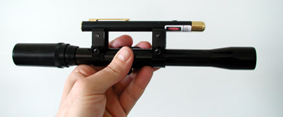
Looking into Lasers ruining camera sensors
RESEARCH - Science behind and maybe artists who are looking into it too
Michael Naimark -
The first thing that I stumbled upon (that was actually worth a read) is an essay called "Camera Zapper" by Michael Naimark. It looks at lasers being used as activist tools to temporarily dazzle and disable security cameras. I didn't even consider that there might be a political use to this, which I suppose now gives me an angle to use in the work, especially considering today's discourse surrounding mass surveillance and 'Big Brother'. Naimark gave a description of how the effect looks, and it drew me in after reading it. He writes;
"The results were striking. The tiny beam neutralised regions of the camera sensor far larger than the actual size of the beam. Properly aimed, it could block a far-away camera from seeing anything inside a small window".
Apparently, this technique is quite divisive; some people find it exciting as it can be used as an activist tool, but others see it as not being too dissimilar to burning a canvas after a piece had been painted on it. Personally, I think that using this tool that disables mass observation (even if temporarily) as a subject powerfully and politically charges the work, which is something I've been looking for and struggling to find after all this time. In this essay, Michael does a few tests using a normal laser pointer, a video camera and varying rifle scopes.


The first is the simplest, it's using no scope and the laser at 3 meters away. It results in a six-pointed star shaped bloom that seems to take up the entire sensor. The effect is breathtaking, and I feel that the bloom would look different depending on which camera I use, so I'm excited to try different ones out.
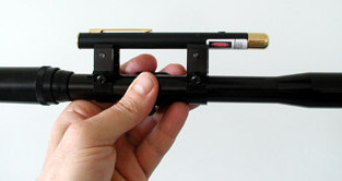


The second test was from 100 meters away, and they employed the use of a rifle scope system. The first result is with a closer zoom, and the second result is with a wider angle. With a wider angle, it seems that the bloom takes up a significantly smaller portion of the image, which would be good if I wanted people to see something in the background as well.


The third test Naimark did was from 200 meters away, and he used a laser gun sight, zoom rifle scope, and a 3-axis adjustable tripod head. From a further distance, you can make more highlight detail out in the background through the intense red beam, which I think would work well to make the image less abstract. He also shows what the beam looks like through a telephoto lens.
The biggest difficulty that Michael came across was aiming the laser at the camera. I feel that given the scale of my digital cameras (tiny) and my preference for how the images look with the laser further away I will struggle with this as well. But, I think that I can overcome this by also using a magnifying device of some kind and filming instead of photographing (so that I can go over the footage and take screenshots of the parts where I manage to get the laser to hit the sensor).
I took a few things away from reading this essay. I think that I would like to do a shoot with this around the city I live in at the moment, and I'd like to look at other forms of anti-surveillance activist methods in the future as well.
I also looked at an article written by Derek Ward which investigates lasers impacts on surveillance cameras. They bought multiple lasers of varying power and a cctv camera to see how far you have to go to permanently damage Big Brother. The article is fairly dull; the results are as you'd expect - lasers do more damage the closer to the sensor they are, and more powerful lasers do more damage at once - but the visual examples they made are brilliant. They have several GIFs of the sensor being damaged and different examples of the camera being blinded, and it all melts together into one amazing red, green, and blue light show. I'd definitely recommend looking at the full article, as I decided not to show the flashing images here (they're a tad too distracting for a blog). You can read the article here.

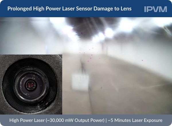

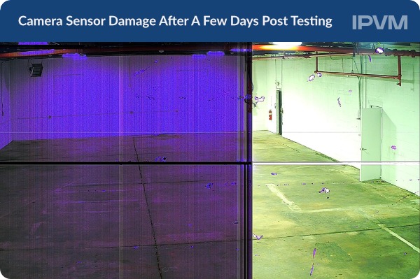

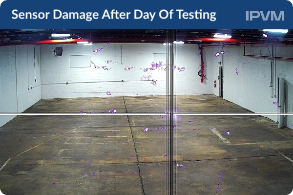
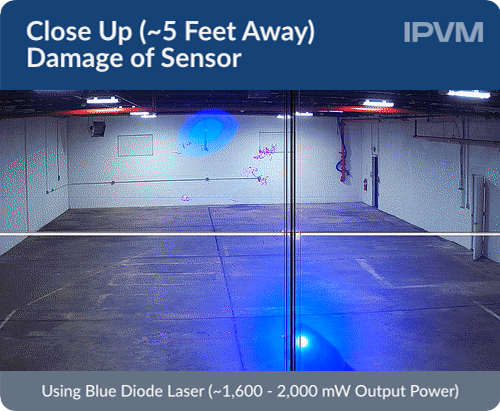
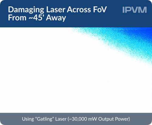
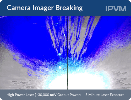
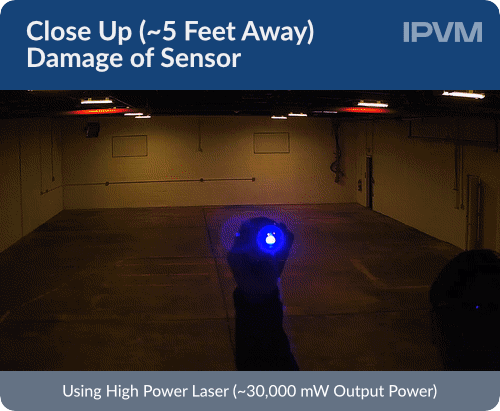
They used several different lasers for this project. They used: a blue diode (~1600 - 2000mW), normal laser pointers (~5mW), a HTPow laser (~30,000mW), a Gatling laser (~30,000mW), and a Pinty hunting laser (~5mW). When scouring the internet for these lasers to buy, I found a website called HTPow.com which contains lasers that go up to 50W, but they are a little out of my price range.


Upon further research, I found more affordable options. 50mW - 1500mW is enough to burn through paper and setting matches alight, so I think that 30W (like the ones they used for the tests) is a little excessive. Since they were doing this test for a more practical, activist reason, it's understandable because they want to do as much damage as possible in a short amount of time, but from a photographer's perspective, I think a slower cremation of the sensor would be more beneficial as I can get more images out of it. The only thing left to do now is to buy a 1W laser and a cheap point and shoot video camera that I can destroy completely.
The only issue I have now is picking a laser colour.

I don't think that it matters too much, but obviously red has a higher contrast than green or blue. For that reason, I would like to go for a red pointer. There wold be more visual interest in the bloom, and it would come out well too in black and white (if I so choose to do that).
I found a website called Laserpointerpro that sells a wide variety of high powered laser pointers from 1mW to 50W. I picked the cheapest option from 200mW to 500mW, and now I'm going to choose my favourite. They are all class 3B (which is the lowest class before it can burn anything, check below to look at the laser class table), so that's not an issue. The two highest Wattage pointers are both green, and the 300mW laser is a blue-violet. As we can see from the tests given by Derek, the higher the Wattage of the laser the faster it does damage, so I think that I would prefer a pointer that doesn't kill it instantly.


Given all of my buying points, it seems like getting the 200mW red laser is the best option for me. The bloom will look the best out of the three lasers in the final images, and it's not too powerful. Also, it's the cheapest, which is great.
https://www.laserpointerpro.com/200mw-650nm-red-beam-light-single-point-rechargeable-laser-pointer-pen-silver-p-3998.html

EXPERIMENT - Film a laser being pointed into the sensor, gradually take screenshots of footage to show stages of damage
Stereoscopic-Panoramic Workshop


Comments